I spent Thursday evening at an insightful UX talk: The Internet in your Pocket with Alberta Soranzo, director of UX at Friday.
Focused primarily on information architecture the talk covered the thought process that drives mobile content strategy, the specific challenges and opportunities of the mobile space and how information architecture and content strategy contribute to the creation of outstanding cross-channel experiences.
Some notes from the talk:
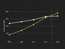
Mobile usage is rising.
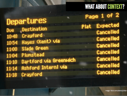
As designers, we must consider context. We need to give the user the right info at the right time – are they at a train station, stressed out and running late or are they in a relaxed state with friends, searching for a good cafe? We must eliminate the user’s anxiety from performing a task (especially one that’s unfamiliar).
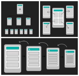
We looked at several different navigation structures for mobile websites. Each has pros and cons and the one to use depends on the individual site. They can be combined together when relevant.
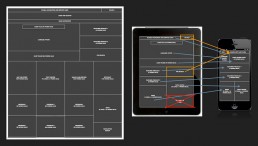
We should design for content, not vice-versa. The content should have a strong structure and be independent of the presentation layer.
The homepage is no longer the first place someone visits (due to direct links on social media etc.). It is now a brand statement rather than a calling card. With this in mind, all NY Times pages allow the user to navigate around the site as if you were on a homepage.