This project was a collaboration with web developer, Matt Buckland. We worked closely with the client team throughout the project.
Background
Cambridge Cookery School provides an exciting modern program of cookery courses for every level of cook, offering courses for adults, children and young people. Their courses offer an abundance of fresh ideas and builds confidence in a variety of skills and cuisines.
The Challenge
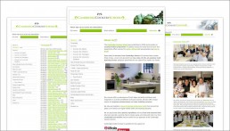
As business grew, the old Cambridge Cookery School website was no longer giving users an accurate representation of the company, and lacked the desired professional feel. They required a website that allowed people to discover them, find and book courses online, and get in contact easily. For a site of this scale, a lot of planning was required; we reconsidered all aspects of the website so that the user experience would be amazing. It’s not enough that a website just looks pretty, it has to be fit for purpose.
Understanding the Users
It was important to understand how the website would be used and who it was aimed at. To better understand who the users were, I attended a cooking class to meet the customers myself (as well as improve my kitchen skills!), the client team were also interviewed regarding their customer-base.
Personas were created to depict the various types of user and their purpose for visiting. Each persona had different reasons for visiting the website and it was important that they all had an easy time accomplishing the task they came for. For instance, someone who was new to the area would use the website differently to a repeat customer. Task Flow diagrams illustrated the different journeys customers would take through the website. The findings influenced the website structure and the content of each page.
Defining the Website and Page Structure
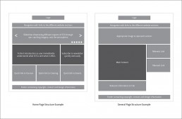
With the website objectives in mind, an appropriate website structure was developed. Before the creation of wireframe, the goals and elements of each webpage were listed. Doing this ensured that every page was clear and served its purpose (credit to Sacha Greif for this technique).
Wireframing
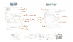
Once the pages’ goals and elements were stipulated, wireframes were sketched to visualise layout and hierarchy. After some experimentation, a foundational page structure was designed to accommodate the content.
Visual Discovery
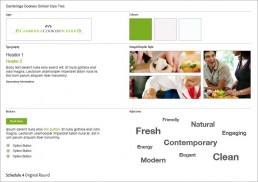
Before visual design began, research was conducted to ensure the new website’s visual style was suitable. The Project Planning Sheet filled out by the client at the start of the project was referred back to in order to reveal any visual preferences or indicative keywords.
Observations included:
- Colours are either natural – suggesting healthy, or desaturated – for a clean, modern, hygienic look.
- Chefs are seen to be smiling and having a good time to add personality.
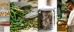
- Food colour is emphasized in the photography.
Visual Design
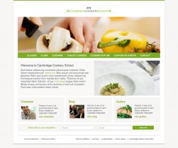
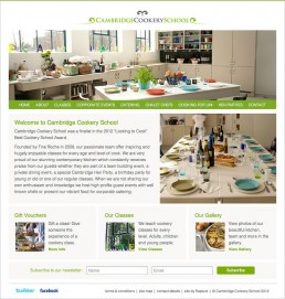
With the information accumulated from the discovery and planning stages taken into consideration, visual styles were experimented with. I spent extra time to explore several design possibilities at this stage to ensure that each design route was very different from one another, prompting further ideas and discussion in the presentation. The client team were fond of the playful approach of Route 2, although it was agreed that the fresh, clean visual style of Route 1 was most appropriate for the brand. We progressed with Route 1 as it aligned with the original project goals.
Visual Design Revisions
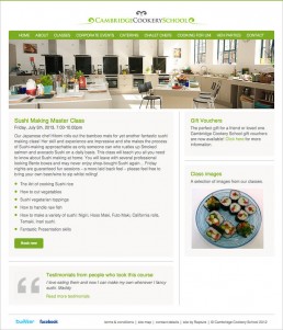
With the fundamental visual style agreed upon, the design was developed based on client feedback. Web development commenced whilst the client team assembled the final website content.
Course Presentation
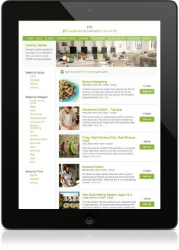
One of the challenges we faced was how to display the vast array of courses on offer. The old site was currently displaying them in a long list, with the only way of narrowing them down by selecting a target age group. The new course page was designed in a way that allowed users to select a course by age group, course type, date, and time, which made finding the right course much easier. Courses are automatically added and removed at predefined dates to avoid any scheduling issues.
Booking
Booking a course takes only a couple of clicks via the ‘Book now’ button. Automated systems were put in place to deal with payment, course reminders and to avoid over-booking.
Easy Updating
The new website was built on WordPress, making it easy for the Cambridge Cookery School team to update and manage content by themselves.
SEO
SEO wise, the new website was a massive improvement, allowing more people in the area to discover Cambridge Cookery School on their search engine. Website visits have soared since launch.
Social Media
We took care of setting up Cambridge Cookery School’s social media and gave ongoing advice and support on best practices.
Conclusion
The client team were thrilled with the results; The Cambridge Cookery School website has become a core part of the business. It is easy for users to learn about the company and book courses securely whilst being simple for the CCS team to manage and monitor.
Testimonial
“We engaged Jack and Matt as we embarked on the creation of our fourth re-design of our website in as many years. We already had a strong visual look which we were keen to maintain and also the added complexity of an on line ticketing/booking system. Our aim was to improve and update the visual content and to make the site even more user friendly whilst keeping our brand identity. Jack and Matt committed to the task, understood the brief and overcame the technical challenges of the booking system. Their young and fresh approach was just what we needed and the end result is exactly in line with what we set out to achieve.”
Tine Roche, Cambridge Cookery School


