Netflix’s new documentary series; Abstract: The Art of Design, takes you inside the minds of eight designers representing different fields in the industry.
Episode 1 profiles Christoph Niemann, an illustrator who’s work has appeared on the covers of The New Yorker, WIRED and The New York Times Magazine. A highlight for me was Niemann’s explanation of what he calls ‘The Abstract-O-Meter’; each idea requires a very specific amount of information. Sometimes it’ requires a lot of detail/realism, other times it requires only very few details. Either way, each idea sits somewhere on the abstract-o-meter scale.
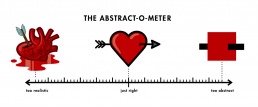
The illustration of a heart to symbolise love is used as an example:
When you illustrate the heart as just as a red square (the ultimate abstraction), no one knows what you’re talking about so it totally falls flat. On the other other extreme, when you take a hyper-realistic approach and draw an actual heart made out of flesh and pumping blood, it’s so disgusting that the last thing anyone would ever think about is love. Somewhere between that abstract red square and the literal, hyper-realistic image of a heart is the graphic shape that kind of looks like each and is just right to symbolise love.