Expressive Design Systems
Here are some notes I made from Expressive Design Systems by Yesenia Perez-Cruz, a brief, straight-to-the-point guide to auditing, creating and managing design systems that are purposeful, meaningful, and scalable.
Introduction
Without a unified language, all products drift toward inconsistency. The problem with this drift isn’t that products look different (though that’s part of it). The larger issue is what this inconsistency represents (and exacerbates): a lack of alignment and communication across teams, a diluted brand voice, and a disjointed user experience.
Terminology
A pattern (or component) library is a collection of reusable user interface (UI) building blocks that are shared across teams and assembled to build products.
A style guide is documentation, often on a website, that contains your company’s brand language, your component library, and rationale about how these components should be used.
A design system is the broadest of these tools, and explains how a team should create products. It encompasses the pattern library and style guide, but also includes underlying design principles, rules, and guidelines to help teams create cohesive experiences.
What does your team need?
If your goal is to improve the design and user experience of your products by enabling harmonious, integrated design and development work, then you need more. A pattern library alone can’t create alignment across multiple product teams that are all working toward their own objectives. And a generic design system isn’t going to focus on the common ingredients that make your organization and products special.
Design system principles
When you create a design system, you’re not just creating reusable patterns—you’re operationalizing how your company approaches design. Your team’s design system needs to be highly specific to your team’s needs.
What makes a design system expressive?
Expressive design systems have three defining qualities:
- They are purpose-built. Your design system should align your team on a shared vision of your brand’s voice, visual style, and behaviour.
- They support a range of expression. Your design system should enable meaningful experimentation and divergence while still retaining the spirit of the system writ large.
- They inspire use. Designers should feel motivated to solve complex problems with their design system, rather than feeling constrained by it.
Zooming in and out
Working on a design system isn’t a linear process. You need to continually zoom in and out, jumping between small elements and your entire product ecosystem.
Purpose and Principles
Unity & cohesion
Design systems create better products when they provide both unity and cohesion. Unity means that things feel complete—all of your brand elements work together as one. Cohesion is the quality that makes your user interfaces easy to understand across the experience.
Unity is easier to accomplish than cohesion, because it can be solved by creating tools: style guides, brand languages, shared components. Cohesion is more complicated because it can’t be solved with a tool alone. In order to create products that feel cohesive, you need to align teams around a shared definition of how your brand should look, feel, and behave. That’s why it’s important to set a purpose and establish principles.
Setting a purpose
Design systems are all about alignment. Early on, you need to align your team around why a design system matters. You can do this by defining a purpose statement for your design system.
Finding your purpose statement
Your purpose statement describes what your team is trying to achieve with the design system. It answers four questions:
- What is the goal for our design system?
- Why is that goal important?
- How will the design system help us?
- Who is the design system for?
Getting aligned on exactly what you want to accomplish—and how you’ll know you’ve succeeded—will set the design system on the right path from the beginning.
Listening to users
Successful design systems need to serve many audiences: designers, developers, content strategists, products managers, and, of course, end users. Interviewing these users will help you set a purpose.
Set up some interviews with the users of your design system. Be sure to talk to people from different disciplines, as well as people with different levels of experience.
Creating aligning principles
Designing products requires making hundreds of decisions quickly. A small team can rely on tribal knowledge to ensure that those decisions are consistent. But as teams grow, the ability to make aligned, consistent decisions becomes harder. Your products won’t feel cohesive if everyone is working from a different definition of “quality.” To address this, we need to create a shared framework for decision-making. These are our design principles.
Effective design principles should be:
- Specific and opinionated
- Grown from within your team
- Decision-making tools
There are two types of principles: universal and specific. Universal principles are broadly applicable and can be used for all kinds of design. “Delightful” and “simple” are examples of universal principles. By contrast, specific principles map directly to a specific product and are used to align teams around a common language. To create expressive design systems, you need specific principles.
These principles should not only be specific to your product, but should also embody the qualities you want your user experience to have.
Often, these principles already exist within people’s minds, but need some work to define and document.
Listening to users
Uncover problems:
- What are their biggest pain points?
- Where are they currently duplicating their efforts in inefficient ways?
- Where is communication between designers and engineers starting to break down?
Uncover goals:
- What would a design system help them achieve?
- What information do they need from a style guide?
- How would they want this information presented?
- What rationale would they need in order to trust the information in a style guide?
Decision-making tools
Good design principles help your team make decisions faster. Without clear benchmarks, design reviews can become subject to whim and opinion. Principles give structure to design feedback so you can make sound decisions more efficiently.
Establishing your principles
You don’t want to create principles in a vacuum and then drop them on your team. Instead, bring people together to craft principles collaboratively. Start by holding a principles workshop, either in person or remotely. The benefit of developing these principles in a workshop is that it generates momentum across your organization.
Once you go over five principles, people start forgetting them. Aim for five principles and focus on making the language as clear as possible.
Design principles can be considered a tool, just like a UI kit. They should be applied throughout the design process in order to create better experiences. Design your principles with adoption in mind.
Get insights from teams about how easy it was (or wasn’t) to use the principles. Did they feel tangible enough to apply to their work? These insights will help you refine your principles before you release them more broadly.
Turn your principles into decision-making tools
Put your principles into practice by coming up tools that make it easier to apply them. For example, you could create a design review template that has the principles baked in, or scorecards for teams to measure themselves against the principles in project retrospectives.
A strong foundation
Even though component libraries and style guides are the most visible outcomes of a system, it’s important to start with your purpose. A design system that has a solid purpose and principles, even with just a handful of components, will be more cohesive and dynamic than a system with hundreds of components but no shared purpose, principles, or foundation.
The process behind the system
Design systems, like cities, need proper planning in order to work well. A well-planned system is easy to use, inspires participation, and grows stronger over time. A poorly planned system feels disjointed, confusing, and difficult to use. And if you don’t plan your system well, people will start creating their own systems on the outskirts.
When you start developing a design system, you need to answer some big questions:
- What products will this system serve?
- Which people should we involve?
- What is the scope of this system?
Evaluate your design language
How well does your design language express your brand? You need some way to measure whether your design language is effective—that is, how well it expresses your brand. Before you start evaluating, it’s helpful to come prepared with any documentation of your strategic brand guidelines. That could be a brand playbook, brand purpose statement, or design principles.
Is your design language consistent? While the first question is all about the quality of your design language, here you want to understand the quantity of your design elements. Are you using design elements in a consistent way? Are primary buttons always blue? Is the body copy 18px throughout the site? For each of your categories, add up how many variations currently exist. Type sizes and colour hex codes are common culprits of inconsistency.
Evaluate your components
For your first design-system release, you’ll want to choose a blend of both high-frequency (basic building blocks) and high-volume (unique to your product) components.
Chances are that in addition to basic components, your specific product has a few larger components that repeat often, like Airbnb’s listing cards, or the Guardian’s story cards. Consider these high-value components. They might not repeat as often as high-frequency components, but they have a huge role in defining the experience of your product. Improving the functionality and design of high-value components is a great way to improve the overall design quality of your products.
Group components by purpose
When components lack clarity and purpose, the result is inconsistency. If you don’t define a purpose, you may get designers and engineers making a new version of a component for a small visual change. An increase in the number of one-off components across your system will increase technical and design debt—the exact opposite of what you want.
Grouping components by purpose works best to help you understand your larger components, especially ones that display content. That’s because the variation on smaller components, like buttons, tends to be visual, not conceptual
Ask your auditors to work together to group components they think serve a similar purpose. This usually leads to some debate about each component’s purpose until people start to get aligned. Eventually, you’ll have a pile of components that seem like they’re solving the same problem. How do you know if components are solving the same problem? Ignore the visual design for a moment and focus on the content.
It’s very likely that you found a lot of redundant components in your audit. You can’t bring all of the existing components into your new system because your goal is to reduce design and technical debt. You need to determine whether a component adds value before you try to bring it into the new system.
Is your design system working well?
“Working well” means the product is upholding your design principles, the design language is communicating your brand voice, and the design system as a whole is responding to user needs.
What makes a good component?
Purposeful. All of your components should solve a specific problem. Define them by their purpose, not by how they look.
Reusable. Your components should work for multiple use cases. Reduce the number of components that only work for a singular use case.
Flexible. They should work in many different contexts. If you design components that are too rigid, people will create their own components and you’ll end up with a bloated system.
A big part of design-system work is gathering, consolidating, and documenting components until your first release.
Another benefit of basing components and their variations on their purpose (instead of on their visual style) is that it lets you iterate on them over time. Once a component is integrated into a product, product teams can measure how well the component solves the problem it is targeting. This allows teams to feel more confident about evolving and improving components.
Documenting components
Strong, clear, thorough documentation is an important part of any design system. A component or pattern is only as good as the guidance that explains how to use it. Your documentation should help everyone building products understand how to use your components to craft experiences. Explain the purpose of each component and the UX rationale behind it so that everyone involved with the system can use the components thoughtfully.
At a minimum, your component documentation should include these elements:
- Name and description: A title and short description that helps users quickly understand what the component or pattern is.
- Purpose: A scannable statement that explains the purpose of the component. You want designers and developers to be thoughtful about how each component fits into the bigger picture.
- Example: Preferably an example of the component at work, both in design and in code.
You may also want to include:
- When to use it: The situations in which a component or pattern should be implemented.
- When not to use it: Specific situations where you know a pattern will not work, and what to use instead.
- Content guidelines: How content should be written for this component based on what it needs to communicate to users.
- Related patterns: Other patterns or components in the system that may be related in purpose, presentation, or content.
Naming components
The naming of a component should be as diverse and cross-disciplinary as your team is. In “The Language of Modular Design,” Alla Kholmatova explained the importance of collaborative naming: “It’s not so much about giving something a great name (although, of course, that’s an ideal to aspire to), but agreeing on the name. That determines how the element will be used and helps to ensure that it’s used consistently by everyone”
Designers, engineers, product managers, content strategists—all should inform the name of your component. Establishing a clear, shared language helps us make better decisions about the purpose of each of our components and how they should be used. It improves collaboration and speeds up design and development.
A good component name should be:
- Purposeful. A name should describe the purpose of the component, not what it looks like.
- Specific. A name should be as straightforward as possible.
- Inclusive. Use language that everyone can understand.
Communicating your brand
Having consistent building blocks won’t guarantee a harmonious layout. The difference between a design language that feels complete and one that feels random is usually a judicious use of space. We won’t be able to predict all of the different combinations of components that will make up our pages. What we can do is think about our brand language as it applies to a component hierarchy. When we are thoughtful about how our brand gets expressed at each level of a component hierarchy, we achieve harmony.
Component hierarchy
Different teams define the hierarchy of their components in different ways. As a general rule, though, these are the different layers:
- Basic components: Small, standalone components like buttons and icons
- Composite components: A collection of basic components combined to make larger, more specific components
- Containers: Areas of a page that contain a collection of components
- Layout: How all of the pieces are laid out on a page
Basic components
The lowest layer in the hierarchy consists of basic components, sometimes called elements, basics, or atoms. Basic components are the smallest possible elements that can’t be broken down any further, like buttons, links, or text fields. They are the building blocks of your system, and because you will use them to create all of your larger components, they need to be modular. Basic components also need to be the most flexible; because they’re repeated so frequently in your interfaces, they need to work in a range of contexts.
At the basic component level, colour and typography should be functional.
Basic components need to be the most flexible; because they’re repeated so frequently in your interfaces, they need to work in a range of contexts.
The rationale you provide for how basic components should be used will set your products apart. Ideally, this rationale will explain how each component can serve the design principles you established at the outset.
Composite components
The second layer is more complex. Composite components, often called components , modules , or molecules, are collections of basic components that have been arranged in specific and opinionated ways. These components can also be reusable, but they often serve a more specific purpose, which makes them less flexible. While the main measure of success for a basic component is reusability, composite components are measured by how well they solve their chosen problem.
The choices you make at this level should build on the choices you made at the basic level. If you designed your buttons with generous spacing, then your larger components should also have airy spacing.
At the composite component level, you start to feel the design language more because you’re looking at a collection of components together.
Containers
Containers (or regions) are larger areas of a page that contain composite components. They are typically full-width horizontal elements; pages are then composed by stacking containers on top of each other. Containers are useful when you want to group content in a specific way, but need to provide flexibility in how those content chunks are arranged.
Layouts
Layouts (also known as templates ) determine how these components can be arranged on a screen. They are defined by how the information on a screen will be used and how content will be organised.
When you look at your design language at the layout level, you want to ensure that all of your branding attributes work well together.
Big levers & small dials
We not only need to think about design elements at each level, but also how they ascend the hierarchy. To do this, we need to explore our design language both globally and granularly.
Just as there’s a hierarchy to components, there’s also a hierarchy to the kinds of design decisions you make. Think about it in terms of big levers and small dials. Levers are broad, sweeping decisions about how our experiences should feel. Dials are small, detailed choices that enable those feelings.
There are four big levers that determine what a design will feel like: size, scale, density, and weight. If you squint, how should your pages feel? Compact or loose? Dynamic or evenly paced? Light or heavy
Defining the levers helps you make better choices about your dials. The dials define granular elements: typography, spacing, and colour values. If your design process is anything like mine, then you know the feeling of meticulously increasing and decreasing a font size by one pixel before finally landing on a size that feels right—it’s like turning a dial ever so slightly.
If you define your dials but not your levers, you risk ending up with design choices that feel arbitrary. You may have really tight spacing in one section and loose spacing in another.
Even though we won’t know all the ways components will be used to build pages, we can have harmonious layouts if our levers and dials are in tune.
Achieving Harmony
“Always design a thing by considering it in its next larger context—a chair in a room, a room in a house, a house in an environment, an environment in a city plan,” said Finnish architect Eliel Saarinen. Remember that components aren’t used in isolation, but around and within each other.
Managing design systems
A good design system helps you improvise. Think of it like cooking: if you’ve done all the prep work ahead of time—chopped your vegetables, measured your spices—then you can start improvising as you assemble your ingredients. Following this metaphor, your design system is your pantry, not your cookbook. You have space to create your own recipe, to add more garlic or less salt if you want to, but you won’t switch to an entirely different cuisine because you won’t have those ingredients.
If you’re creating a design system for several teams, each with its own designers and developers, you’ll want to give those teams the freedom to design their own chairs. The system shouldn’t limit them from creating the best possible experience. Basic components with guiding principles about how to craft good experiences give teams that flexibility.
It’s impossible to anticipate all of the features your system will need up front. If you’ve set up a clear feedback loop between a systems team and a product team, then you will be able to evolve your system organically. A good feedback loop starts with clear communication across teams.
The design system grows stronger when people contribute to it—and people are more likely to contribute if they feel invested in the success of the system. Decide on which contribution models make the most sense for your team and then clearly broadcast them.
When you create an expressive design system, you’re not just creating reusable components—you’re operationalising design across an organisation.
Successful design systems have three major parts: components, guidelines for how the components can be used, and a governance model that unifies the teams that use and contribute to the system. Instead of focusing intently on just one of these areas—like, say, shipping a UI library with hundreds of components—build your system by starting small in each.
A complex system that works is invariably found to have evolved from a simple system that worked. A complex system designed from scratch never works and cannot be patched up to make it work. You have to start over with a working simple system.
Writing for Designers
Writing for Designers from A Book Apart lays out a process for designers to follow when writing copy along with some tips and tricks to help along the way. I found that the writing process outlined has many parallels with the design process and the advice in this book can be quite easily used when designing too. Here are my notes:
Introduction
Choosing words and writing what appears in an interface forces us to name components, articulate choices, and explain things to the user. It’s part of design.
Writing is part of design. Sometimes words get written off as mere “details” in our designs. True details can wait until the end of your design process. Words, however, are deeply integrated throughout the user’s experience of your design.
Writing can reinforce how you want users to think about your design. Writing can explain the approach or philosophy that underpins your design. Writing can guide users through complex processes. Writing can even help cover for the quirks and compromises in our designs.
The book covers three general categories of writing you might have to do to support your design work:
- Interface copy: Often referred to as UI copy or microcopy, this is the text that’s deeply integrated within the interface, like labels for form fields, text on buttons, navigation labels on a website, error messages, and similar. It’s often made of single words or short phrases. If the interface would “break” or be extremely hard to use if you removed this text, we’ll call it interface copy.
- Product copy: Writing that’s integral to the function of the site/product/app/experience, but not necessarily a direct part of the interface—the body of an onboarding email, for instance, or a description of updates to an application in a changelog. This is content focused on helping/supporting the reader.
- Marketing copy: Longer-form writing that is primarily filling a sales or promotional sort of role. This is content focused on persuading the reader.
At the end of the day, writing is just thinking plus typing.
Writing is more like design than you might think. Common design activities like framing the problem, identifying constraints, and exploring solutions are part of writing, too. Many of the methodologies one might use in UX work can be part of a writing workflow: stakeholder interviews, user research, content auditing, ideation workshops, critiques, and more.
Prepare
There’s more to writing than writing, especially when it’s part of design. It’s easier to get the writing done when you thoughtfully and intentionally prepare to do the writing. Smart writers do prep work on every assignment.
Do each of the following in order to fully prepare to get the writing done:
- articulate the assignment
- collect inputs
- generate ideas
- create structure
- make space to write
Taken together, your deadline, role, context, requirements, and scope will give you a complete idea of what you need to do to be done. That’s your assignment.
Err on the side of capturing the above information information publicly, even if it seems like no one else cares, just to cover your butt. The header area of a task or ticket in your project management system is a great option, or even just an email to your team: “Hey friends, here’s what I understand about the writing needs on this project. Let me know if I’ve missed anything…”
Later on in the project, you’ll be grateful to have a paper trail, so to speak, as reviewers and stakeholders start asking questions and trying to poke holes in your writing.
Brainstorming: When brainstorming, avoid decisions of all kinds. Decision-making is a form of convergent thinking. It’s an act of limiting, reducing, filtering, choosing—editing. Making decisions, even small ones, brings the scent of criticism and closed-mindedness into the room that can spoil an otherwise productive brainstorming session.
Freewriting: Freewriting is stringing words together for a set amount of time. It’s especially effective for longform product and marketing copy.
Outlines: Clear thinking is powerful. With a strong outline, some of your writing will seem to write itself!
Developers and designers know that there are some kinds of work that require you to build a bit of intellectual momentum, and that being interrupted, even briefly, can kill that momentum. Writing is that kind of work, too.
Compose
Writing isn’t magic, but that doesn’t mean we can’t use a few tricks to make it easier. Those tricks revolve around two objectives: to write quickly and to write everything.
Write quickly
You should write quickly, for two reasons:
- If you try to compose the perfect draft one perfect word at a time, you’ll never get the writing done.
- Good clear writing comes from good clear thinking. The less time your thoughts have to rattle around in your head, the more time they can spend in the clear light of day—and the better they’ll sound in your design.
If you find yourself fussing with fonts and formatting before all the words are written, consider writing in a low-fidelity environment like a text editor.
I recommend adopting a “lazy” mentality and occasionally asking yourself if there’s a faster or automated way to do what you’re about to do.
Write everything
If you’re still lost on how to start or what to write, you may need to revisit your inputs and assignment. But more than likely, at this point, you just need to start writing. Pick something easy to get your fingers moving. (You don’t have to start at the beginning.) Continue writing, and get the whole thing written before you start perfecting individual parts of it. Editing comes later, and besides, what you write in one area might impact what you write in another area.
The best way to write also generates the best kind of writing: say just one thing at a time. Say one thing in your headings. Say one thing on your buttons. Say one thing in the tooltip text, one thing in the error message, one thing in each paragraph. Writers get stuck (and readers get lost) when the words are trying to express too much at once. Words are powerful, yes, but still bound by pesky constraints like “time” and “how brains work.” If you’re feeling overwhelmed, or the words are coming slowly, narrow your scope. Focus in and say just one thing.
ACBs
Practice your ACBs The ACBs are a set of writing and editing lenses created by Ken Rand in his book The 10% Solution. The acronym stands for Accuracy, Clarity, and Brevity. The order of the lenses is as important as the lenses themselves.
- Accuracy: Start by writing something that is objectively true. The labels in our interface copy need to correspond with what actually happens when the user interacts with those elements. The features and benefits in our marketing copy need to reflect the actual product the user is signing up for, not an imagined or ideal version. The product copy needs to provide real, useful guidance. If what we’re writing is wrong, we’re already sunk.
Accuracy in interface copy requires understanding how the interface actually behaves. If you’re not sure, ask! You might be surprised how often you’ll discover a button, link, or other element whose behavior is a mystery, even if you designed it. - Clarity: After you have your facts straight, you want to focus on making your writing clear—that is, straightforward, simple, and easy to understand.
To create clarity, look for opportunities to: replace resplendently fantastical fancy language with simpler language (and uncommon words with common ones) put things in a logical order add supporting information add examples and anecdotes to reinforce your point delete things that don’t support your main idea define concepts that users might be unfamiliar with
Clarity is in the middle of this ACB sandwich because text can never be clear if it’s not accurate or too brief. - Brevity: Brevity is last—it’s admirable, but it should never cause you to sacrifice accuracy or clarity. Short doesn’t automatically mean easier to read or understand.
Designers can get stuck because they start with brevity. Sometimes they are trying to write text directly within the confines of a wireframe (and without accurate character constraints). Other times, a well-intentioned but ill-informed stakeholder is pushing them to “make it shorter,” because that’s the only advice they knew about writing for the web. “How do I make it fit?” is the right question at the wrong time. Start by writing out a complete idea, then refine and trim.
Keep writing
Write quickly, with tools that make writing easier, in an environment conducive to getting the writing done. Repeat this until you’ve written a decent, complete draft that meets the requirements of your assignment.
The draft is just the start. Next? We Edit.
Edit
There’s a bit of a fuzzy line between composing and editing. Often, to reach that complete first draft, we’ll cut and paste words and phrases, rewrite ideas, maybe even scratch a whole screen’s worth of text and start over. “Tweaking” the text while we write will catch errors and improve phrasing, but it won’t elevate the consistency, clarity, and quality of the writing.
Editing is about substantively improving the writing. Don’t confuse this with proofreading, where you fix typos and punctuation.
The mental shift from writing to editing doesn’t happen automatically. If you’ve just finished your first big run through the Compose phase, job one is to take a short break.
Track your changes
You need a system to track and manage revisions before you begin editing.
- You want to preserve your first draft for reference.
- You want to be able to undo (and redo) changes that you and others make to the text with relative ease.
- You want to keep track of the who and the why of any changes more seriously than correcting typos and spelling errors.
Editing can be dangerous. Move too quickly, and you can lose the thread of what you were trying to accomplish—or lose good work altogether.
Know why you’re editing
Editing requires an intention, a lens of sorts—an answer to the question “Editing for what?” You could rewrite a draft fifty times, but if you don’t have a goal in mind during those rewrites, how can you know whether it’s getting any better? Having a lens changes your mindset from merely reading the text to evaluating the text against particular criteria.
Common editing lenses.
Focus: Editing to make your writing more focused means cutting out stuff that isn’t related to the key goals and messages of your design. Writing is focused when every word—every word—is serving a clear purpose.
Simplicity: If you feel like the writing is too complex and could benefit from being simpler, there are three key levers you can manipulate:
- Structure: How it’s organized. Things that feel complex often feel simpler once they’re in the right order. It’s the same information, mostly the same words, but organized in a way that adds context and clarifies the meaning.
- Language: The words you use. Many organizations strive to apply principles of plain language to their writing—using the simplest words possible in any given situation. Plain language doesn’t mean dumbed-down or boring; directness and clarity make room for your big ideas to pop.
- Concept: The big idea behind the writing. Clear concepts keep things simple. If you’re explaining something new or complex, consider a metaphor that’s relatable for your primary audience.
Readability
Readability isn’t about legibility in the design sense, but about what’s happening in a reader’s head as they process the words.
If we want our writing to be readable and user-friendly, we need to do more work now so that our readers have less work to do later. For instance: Extract the most important point and put it right at the top. Clearly specify the next action the reader needs to take. State whom the information is for (or not for). Vary the lengths of sentences and paragraphs. (Rhythmic variety is easier to read.)
Consistency
Editing for consistency means making sure your writing agrees with itself, and that it agrees with all of the other stuff it’s connected to. Little inconsistencies creep in everywhere:
Part of your job is to ensure that the words you use to describe product features and interface components are consistent throughout the experience. One way to achieve this is through the application of a controlled vocabulary. Controlled vocabularies are like custom dictionaries. They can exist as a simple list of terms and definitions; you could even incorporate them as a layer in a design pattern library.
Putting your ideas in the right order also adds impact and strength. In a first draft, you’re figuring out what to write as you’re writing it, which means that the most interesting idea—the one with the most impact—often ends up at the end of your sentence, paragraph, or flow. Move it to the top,
Strength
Do the words make an impact? Does the writing feel strong, or does it feel passive? Passive voice is almost guaranteed to suck the strength out of your writing.
Passive voice has no ownership—it feels weak—whereas active voice takes a stand—it feels strong. Compare, for instance:
- Passive voice: “Mistakes were made.”
- Active voice: “I screwed up. My bad.”
Passive voice isn’t wrong, per se, but it has less impact than active voice. In active voice, there’s action, not just existence.
Tone
Getting the right tone for your writing means that it’s emotionally appropriate to the audience and subject matter. It’s about finding the right “vibe,” the right “level” for the writing.
There are a few specific angles on tone that often apply to business and design writing.
- Urgency
- Scale
- Emotion
Do the editing
To effectively edit your writing, you need to introduce a layer of abstraction between you and the copy. That abstraction layer can be a hack, a tool, or another person (like an editor)—whatever you need to approach the work with more distance and objectivity. Choose editing tools that make you look closely and carefully at the actual words that have been written, not just your impression of what it says.
Your pattern-optimized brain wants to make sense of whatever mess of letters it encounters, and it will lie, cheat, and steal to make that happen. That means that a quiet, in-your-head readback is not a great way to catch some of the more pernicious errors of grammar, spelling, and formatting that will plague your copy. There are smarter approaches to reading your work that will help you edit.
Read it
Reading your text out loud (into the air, making actual sounds with your mouth) is one of the most recommended bits of editing advice for writers.
An open-plan office is writer’s hell
While you’re reading, listen. Listen for anywhere that you trip up, anything that sounds funny, anything that’s hard to say, anywhere that you got lost. Mark those passages and consider them for revision.
Read it out loud to a person. There’s also something magical about “performing” your text for someone—it engages a very different part of the brain. You may well surprise yourself with a creative improvisation as you’re speaking the words that wouldn’t have occurred to you as you were writing them.
Have the computer read it to you. Text-to-speech is a wonderful accessibility tool, and just so happens to be handy for writers, too.
Have a person read it to you. Readers who are not you might put the emphasis in unexpected places, revealing potential ambiguities. You can hear where they hesitate and where they speed up.
Ask for feedback
Stakeholder reviews—for both design and writing—are often built into our processes. What doesn’t occur to many writers, however, is that they may be able to ask stakeholders for feedback before asking them for approval.
How you frame your invitation matters. Dropping a meeting invite on someone’s calendar called “Review onboarding text” sets a very different tone than sending a message asking if you can borrow a few minutes of their time at the end of the day to run some preliminary approaches by them.
Be clear what kind of feedback you’re looking for, and ask specific questions. For example: Does this include all of the information we need to communicate to customers? We’re trying out a lighthearted tone. How would you feel if the final draft ends up sounding something like this? I’m focusing on structure right now. Is this the right order to tell this story? I want to know what questions you think customers will have after reading this.
It helps to articulate for stakeholders where you are in the process, and to assure them that, yes, they’ll have a chance to see the final text, yes, it’s going to go through legal, yes, someone is going to proofread it, yes, they can see it before it goes live on the website, etc.
(Never assume that a stakeholder will remember what they told you when it comes time to approve the final text. Keep your receipts!)
Collaborate with others
Sometimes, for whatever reason, you just can’t quite figure out how to say what you’re trying to say. Or you’ve said it, and it’s blah. Time to bring in a fresh pair of eyes. Collaborating with colleagues can be one of the quickest and most effective ways to help you get unstuck—or to unsuck a particularly rough passage. Even brief conversations can yield big outcomes.
A handy framing device for these collaborations is to ask, “How would you approach this?” That’s more freeing than “What’s the best way to write this?” and more forward-looking than “What’s wrong with this?”
Lock it in
Sometimes, the hardest part about editing is stopping. It can feel like there’s always more to improve upon, more people you should run the copy by, more of the word count you should trim away.
This is part of why we plan our writing workflow—editing rarely feels “done,” but if we’ve completed our workflow steps, it’s done enough. Eventually, you have to say: “This is the text. These are the words. We are moving forward with these words.”
Clearly articulating the assignment, as we did in the Prepare phase, lets you know when you can finally put your pencil down and step away from the role of writer, even and especially if the design itself is not yet done. This last phase, Finish, includes all of the steps big and small you need to take care of to complete your writing assignment, including approvals, hand-offs, reintegrating it into the design, and reflecting on your work.
Finish
Getting the writing approved
As the writer, there are some things you’ll want to be prepared for during these final approvals. They will probably be familiar from your experience as a designer:
- The swoop and poop: A clear assignment and a well-maintained changelog can help serve as your umbrella, since sometimes the pooping is motivated by a mistaken belief that everything about the writing is arbitrary. Identifying important stakeholders early and integrating them into your process can help alleviate this; people are less likely to poop on something if they feel like they were part of making it.
- Goalpost shifting: You wrote the text to accomplish X, and yet someone is complaining that it doesn’t do Y. They’re evaluating your writing against a different (or more ambitious) goal. It could be that the project’s goals have changed; it could also be that they are having a flight of fancy, or pre-launch jitters. Again, diligence in the Prepare phase (and a good project manager) will help you navigate these conversations.
- Scope and role creep: This is anything that puts you on the hook for more work beyond what everyone agreed to at the beginning. You might be able to guess what I’m going to suggest now as a remedy: diligence in the Prepare phase. Fight these battles early on to articulate a clear role and clear assignment. This helps you avoid looking like the defensive jerk who can’t be a team player toward the end.
Do the finish work
Most of the trades (think: plumbing, carpentry, painting, woodworking) draw a distinction between rough work and finish work.
Finish work is all the stuff you save until the very end to make sure you won’t have to redo it.
Keep everything you’ve written, even if it got thrashed to pieces during editing or review. All that stuff you wrote during this assignment can serve as an input for you on the next assignment. Mindmaps, interview notes, and alternate earlier drafts can all be very valuable.
Prepare for the future
Write down what you’ve learned
So. How did it go? Whether you use a formal postmortem process with multiple participants, or just a bit of “Remember this next time” journaling on your own, you should reflect on a few key things: What changed between articulating and finishing the writing assignment? Why? What tools worked well? What tools didn’t work well? Why? How could you have gotten this work done faster? How could you have improved the quality of the writing? What do you wish you’d known at the beginning that you know now? What is the number one thing you would do differently next time?
Rituals are a way of telling yourself: “The assignment is finished, and I did my best. Good job, me.”
You can always get the writing done with a good plan and a bit of perseverance, and by following the four key phases: Prepare, Compose, Edit, and, finally, Finish.
If you find yourself feeling overwhelmed along the way, remember these truths:
- Writing is part of design. (And being a designer!)
- Writing is always hard. (I feel your pain.)
- Workflow gets the writing done. (It ain’t magic, just planning.)
- You can write. (And you did!)
Resources
“The Grammar of Interactivity” introduced me to the “Wilty Wilt test” for evaluating the clarity of interface copy.
Mary dash’s writing advice on plainlanguage.gov covers a lot of good stuff on active vs. passive voice, modifiers, verb choice, and other writerly matters.
Just Enough Research
In Just Enough Research, co-founder of Mule Design Erika Hall distills her experience into a brief cookbook of research methods. The book does a fantastic job of covering different aspects of design research along with helpful examples and resources. I find conducting user research and usability testing incredibly rewarding and I’m sure I’ll refer back to it often Here are my notes:
Introduction
- The myth of the creative genius makes it very difficult to say “I don’t know.”
- You can use the techniques and methods described to:
- Determine whether you’re solving the right problem.
- Figure out who in an organization is likely to tank your project.
- Discover your best competitive advantages.
- Learn how to convince your customers to care about the same things you do.
- Identify small changes with a huge potential influence.
- See where your own blind spots and biases are preventing you from doing your best work.
- Once you start getting answers, you’ll keep asking more questions. And that skeptical mind-set is more valuable than any specific methodology.
- Businesses and designers are keen on innovation, as well they should be. But the better you know the current state of things and why they’re like that, the better you will be positioned to innovate.
- Design research both inspires imagination and informs intuition through a variety of methods with related intents: to expose patterns underlying the rich reality of people’s behaviors and experiences, to explore reactions to probes and prototypes, and to shed light on the unknown through iterative hypothesis and experiment.
- Design research requires us to approach familiar people and things as though they are unknown to us to see them clearly. We need to peel away our assumptions
- Asking your own questions and knowing how to find the answers is a critical part of being a designer.
- Discovering how and why people behave as they do and what opportunities that presents for your business or organization will open the way to more innovative and appropriate design solutions than asking how they feel or merely tweaking your current design based on analytics.
- You will find that when you ask the hard questions, your job gets much easier. You will have stronger arguments, clarity of purpose, and the freedom to innovate that only comes with truly knowing your constraints.
- “Like” is not a part of the critical thinker’s vocabulary.
- You may run into sample-size queens who dispute the validity or utility of applied qualitative research. These people are often pollsters and marketers who run a lot of surveys. Avoid arguments about statistical significance; you will not win. Instead, keep the focus on gathering useful insights.
The basics
- Ideally, everyone who is on the design team should also participate in the research.
- People who have a hand in collecting the insights will look for opportunities to apply them. Being the smart person is more fun than obeying the smart person, which is how the researcher/designer dynamic can feel if designers are merely the recipients of the analysis.
- The most important thing is that everyone involved knows the purpose or goal of the research, their role, and the process.
- To choose the best research tool for your project, you’ll need to know what decisions are in play (the purpose) and what you’re asking about (the topic). Then you can find the best ways to gather background information, determine the project’s goals and requirements, understand the project’s current context, and evaluate potential solutions.
- Generative or exploratory research: “What’s up with…?” This is the research you do before you even know what you’re doing. It leads to ideas and helps define the problem.
- Generative research can include interviews, field observation, and reviewing existing literature—plus feeling fancy about saying “generative research.”
- Descriptive and explanatory: “What and how?” Descriptive research involves observing and describing the characteristics of what you’re studying. This is what you do when you already have a design problem and you need to do your homework to fully understand the context to ensure that you design for the audience instead of yourself. While the activities can be very similar to generative research, descriptive research differs in the high-level question you’re asking. You’ve moved past “What is a good problem to solve?” to “What is the best way to solve the problem I’ve identified?”
- Evaluative research: “Are we getting close?” Once you have a very clear idea of the problem you’re trying to solve, you can begin to define potential solutions. And once you have ideas for potential solutions, you can test them to make sure they work and meet the requirements you’ve identified. This is research you can, and should, do in an ongoing and iterative way as you move through design and development. The most common type of evaluative research is usability testing, but any time you put a proposed design solution in front of your client, you really are doing some evaluative research.
- Causal research: “Why is this happening?”. Causal research often includes looking at analytics and conducting multivariate testing. This means reviewing your site traffic to see how visitors are entering and moving around the site and what words they might be searching for, as well as trying design and language variations to see which ones are more effective.
- As long as you’re clear about your questions and your expectations, don’t fret too much about the classification of the research you want to undertake. Remain open to learning at every stage of the process. And share this love of learning with your team. Your research will benefit from a collaborative approach that includes assigning specific responsibilities to different people.
- Just as with design and coding, every time you complete some research, you’ll have ideas for how to do it better next time and you’ll have found new ways to incorporate learning into your work.
- Listen. Be interested. Ask questions. Write clearly. And practice. Whatever your day job is, adding research skills will make you better at it.
- The whole point of doing research is to have a stronger basis for decision-making, so if another level of decision-making, such as executive fiat, trumps the research, you will have wasted your time. Get ready to advocate for your research project—before you start it.
- This is applied research. You just need to have (or develop) a few qualities in common with a good scientist:
- Your desire to find out needs to be stronger than your desire to predict. Otherwise you’ll be a mess of confirmation bias, looking for answers that confirm what you already assume.
- You need to be able to depersonalize the work. There are no hurt feelings or bruised toes in research, only findings.
- You need to be a good communicator and a good analytical thinker. Otherwise questions and reports get muddy, and results will be worse. This is just a set of skills that most people can develop if they have the right attitude.
- Upfront research can provide a basis for decision-making that makes the rest of the work go much faster. Nothing slows down design and development projects as much as arguing over personal opinions or wasting effort solving the wrong problem. And you can start small. A couple of weeks can mean very little to your overall schedule while adding significantly to your potential for success.
- There are a lot of things you can find out in beta: what functionality is working, whether users have a hard time finding core features. But there are also a lot of things that are very helpful to know before you start designing or coding at all, and you can find those out pretty fast: what your target audience is doing right now to solve the problems your product or service purports to solve, whether people want this product at all, and what your organization has to do to support it.
- Familiarity breeds assumptions and blind spots.
- It’s better to adjust the scope intentionally at the start than be surprised when new information pops up down the road to amend your plans. Research is an excellent prophylactic against unexpected complexity.
- Relevance to the real world is what separates innovation from invention. Understanding why and how people do what they do today is essential to making new concepts fit into their lives tomorrow.
- Research needs to be integrated into process and workflow or it will get shoved in a corner. If your project has a project manager, talk with them about finding ways to make it work.
- The cult of the individual genius designer/developer/entrepreneur is strong. In certain “rockstar knows best” cultures, wanting to do research can come across as a sign of weakness or lack of confidence. Fight this. Information and iteration are the keys to a successful design. Research is just one set of inputs.
- Falling back on ignorance can be a position of strength. Asking naive questions can cut right to the heart of assumptions and open people up to thinking about problems in a new way.
- “How does that benefit the business?” and “Why do you do it that way?” are a couple of terrific questions that can be very tricky for someone on the inside to get away with.
- In addition to, or instead of, direct access to the customer service people, get hold of the inbound support requests. This will be a fantastic source of insights into the ways different types of customers think about their needs and the language they use to describe them.
- You don’t just want insights; you also want a way to put those insights back into the product.
- It’s very helpful to have a clear idea of how product and marketing decisions are made in your company.
- You do need to have some clarity around your audience and the business context you’re operating in. You’re trying to introduce something new into the world. Who needs it and what is important to those people? When you’re discussing the initial design and development of your product, discuss the role of research with the team. Document and review assumptions to identify the areas in which doing some research might be the most beneficial. Get some early agreement on how research will be involved, keep track of your assumptions, and adopt a skeptical point of view. The approach and biases of the founder and the investors might dominate, so if you aren’t one of those, you will have to be very clear about the value of research to your endeavor and savvy about how to make your case.
- From a user experience perspective, the primary problem with Agile is that it’s focused on the process, not the outcomes. It doesn’t offer guidance on what to build, only how. Perhaps your team is more efficient and happier making a lot of stuff together, but how do you know that stuff is the best it could be, meeting real user needs and fit to compete in the marketplace?
- If you’re always reacting without a framework, you need some guiding mandates. Which customers do you listen to and why? Which user stories do you prioritize? What are you ultimately building toward? Research is not antithetical to moving fast and shipping constantly. You’ll need to do some upfront work for background and strategy and the overall framework. Then, as the work progresses, do continual research.
- Aggressively prioritize the highest-value users. Analyze and model data quickly and collaboratively. Defer less urgent research and complete it while the software is being constructed.
- Recruiting and scheduling participants is the most difficult part, so always be recruiting. Set up windows of time with different participants every three weeks. When you have them, you can either conduct an ethnographic interview to understand their behavior before the next round of development or do some usability testing on the current state of the application.
- Use what you learn from the initial user research and analysis to create personas that inform high-level sketches and user stories. Then, when the team is working on a feature that has a lot more engineering complexity than interaction design complexity, you can fit in additional evaluative research.
- Throughout the development cycle, the designers can use research to function as a periscope, keeping an eye out for new insights about users and competitive opportunities while doing usability testing on whatever is ready.
- Wherever there is research there is bias. Your perspective is colored by your habits, beliefs, and attitudes. Any study you design, run, or analyze will have at least a little bit of bias.
- You can’t eliminate it completely—but the simple act of noting potential or obvious bias in your research process or results will allow you to weigh the results more appropriately.
- Below is a starter set of ethical concerns you should keep in mind whenever you are doing research. (For more Thorough guidelines of ethical concerns you should keep in mind whenever you are doing research can be found on the ICC/ESOMAR Code on Market and Social Research website.
- Be a skeptic. Get in the habit of asking a lot of questions. Question all your assumptions and determine whether you need to check your facts. If you’re constantly on the lookout for threats and potential points of failure, you and your products will be stronger.
- You need to be aware of how much you don’t know and what that means.
- Discipline requires you to be ever-watchful for bad habits, shoddy thinking, and other human frailties that will undermine your efforts. Checklists substitute the experience of others for your own.
- Unless you know and can clearly state what you’re trying to find out and why, applied research is a pointless exercise.
- A successful study is preceded by expectation-setting for everyone involved, including the questions to be answered, the methods to be used, and the decisions to be informed by the findings.
- Allow sufficient time for analysis
- Notes or it didn’t happen. Effective research requires effective reporting, and sharing your results and recommendations with others. A good report doesn’t have to be arduous to compile or read. It needs to be sufficiently informative and very clear to anyone who needs to make decisions based on the research.
- To make the best use of your time and truly do just enough research, try to identify your highest-priority questions—your assumptions that carry the biggest risk.
- some assumptions are higher-risk than others.
- Ask this question: given our stated business goals, what potential costs do we incur—what bad thing will happen—if, six months from now, we realize:
- We are solving the wrong problem.
- We were wrong about how much organizational support we have for this project.
- We don’t have a particular competitive advantage we thought we had, or we didn’t see a particular competitive advantage before our competitor copied us.
- We were working on features that excited us but don’t actually matter that much to our most important customers.
- We failed to reflect what is actually most important to our users.
- Our users don’t really understand the labels we’re using.
- We missed a key aspect of our users’ environments.
- We were wrong about our prospective users’ habits and preferences.
- Better understanding of your target users mitigates the risk by validating the assumption and informing your design with real user priorities. In addition, you might uncover opportunities to provide something of even greater value to that same audience.
- No matter how much research you do, there will still be things you wish you’d known, and there are some things you can only learn once your design is out there in the world. Design is an iterative process. Questions will continue to crop up. Some of them you can answer with research and some you can only answer with design. Even with research, you’ll need to create a few iterations of the wrong thing to get to the right thing.
- If you don’t have enough information, or what you’re finding doesn’t quite hold together, the pieces will rattle around in your head. Ask a few more questions or talk to a few more people. Talk through the results. The pieces will fall into place. Learn to listen for that click.
The Process
- One way to know you’ve done enough research is to listen for the satisfying click. That’s the sound of the pieces falling into place when you have a clear idea of the problem you need to solve and enough information to start working on the solution.
- Whatever type of research you’re doing, and wherever it falls in your schedule, follow these six steps:
- Define the problem.
- Select the approach.
- Plan and prepare for the research.
- Collect the data.
- Analyze the data.
- Report the results.
- Just as you need a clearly articulated problem to create a solid design solution, a useful research study depends on a clear problem statement. In design, you’re solving for user needs and business goals. In research, you’re solving for a lack of information. A research problem statement describes your topic and your goal.
- You want to know when you’re finished, so base your statement on a verb that indicates an outcome, such as “describe,” “evaluate,” or “identify.” Avoid using open-ended words like “understand” or “explore.” You’ll know when you have described something. Exploration is potentially infinite.
- The topic and nature of your questions will guide your choice of research activities.
- If your question is about users themselves, you’ll be doing user research, or ethnography. If you want to assess an existing or potential design solution, you’ll be doing some sort of evaluative research
- Once you’ve selected the approach, write a quick description of the study by incorporating the question. For example: “We will describe how parents of school-age children select and plan weekend activities by conducting telephone interviews and compiling the results.”
- In the beginning, don’t worry about getting everything right. If you don’t know, go with your best guess. Since research is about seeking out new information, you’re going to encounter new situations and unpredictable circumstances. Make friends with the unexpected. And prepare to change the plan you’ve made to adapt once you have facts.
- Your research plan should include your problem statement, the duration of the study, who will be performing which roles, how you will target and recruit your subjects, plus any incentives or necessary tools and materials.
- Good recruiting puts the quality in your qualitative research. Since you’ll probably be working with a small sample size, you need the individual participants to be as good as they can be. Participants are good to the extent they represent your target. If participants don’t match your target, your study will be useless.
- A good research participant:
- Shares the concerns and goals of your target users.
- Embodies key characteristics of your target users, such as age or role.
- Can articulate their thoughts clearly.
- Is as familiar with the relevant technology as your target users.
- If you need people in a certain geographic area, see whether there are local community sites or blogs that would announce it as a service. Referring to it as “design research” rather than “marketing research” goes a long way in the goodwill department.
- When recruiting, be vague about the contents of the actual test. If you recruit people from the site you are testing, then just refer to “an interview about this website.”
- The more organized you are in gathering and storing your data, the more effective and pleasant the analysis will be.
- Use a consistent naming convention for research documentation, such as “Study-Subject Name-Year-Month-Day.”
- Take a few moments between sessions to check the files and make sure they’re named correctly and saved in the right place, and note your initial impressions while you’re at it. A few quick thoughts while you’re fresh will give you a great place to get the analysis started.
- A simple interview remains the most effective way to get inside another person’s head and see the world as they do.
- Usability testing is simply the process of conducting a directed interview with a representative user while they use a prototype or actual product to attempt certain tasks. The goal is to determine to what extent the product or service as designed is usable—whether it allows users to perform the given tasks to a predetermined standard—and hopefully to uncover any serious, resolvable issues along the way. The sooner and more often you start doing it, and the more people on your team are familiar with the process, the more useful it is. You shouldn’t even think of it as a separate activity, just another type of review to ensure you’re meeting that set of needs. Business review. Design review. Technical review. Usability review.
- Usability testing can:
- Uncover significant problems with labeling, structure, mental model, and flow, which will prevent your product from succeeding no matter how well it functions.
- Let you know whether the interface language works for your audience.
- Reveal how users think about the problems you purport to solve with your design.
- Demonstrate to stakeholders whether the approved approach is likely to meet stated goals.
- Usability testing cannot:
- Provide you with a story, a vision, or a breakthrough design.
- Tell you whether your product will be successful in the marketplace.
- Tell you which user tasks are more important than others.
- Substitute for QA-testing the final product.
- The Pew Research Center’s Internet & American Life Project is a free and reputable source of data. As the name implies, the work focuses on Americans, but it’s a terrific place to start. Their work is typically survey-based, and good for thinking about trends. (Also, their reports are a good model for communicating clearly about research.)
- What does it all mean? Once you have collected the data, gather it all together and look for meaningful patterns. Turn the patterns into observations, and from those, recommendations will emerge.
- If you are working with a design team, get as many members as possible involved in the analysis. A group can generate more insights faster, and those insights will be shared and internalized far more effectively than if you simply circulated a report.
- Analysis is a fun group activity. You get into a room with your team, review all the notes together, make observations, and turn those into actionable insights.
- Here’s a good baseline structure that can be modified to suit your project’s needs:
-
- Summarize the goals and process of the research. (What did you want to find out? Who from your side participated and in which roles?)
- Describe who you spoke with and under which circumstances (number of people, on the phone or in person, etc.).
- Describe how you gathered the data.
- Describe the types of analysis you will be doing.
- Pull out quotes and observations.
- Group quotes and observations that typify a repeated pattern or idea into themes; for example “participants rely on pen and paper to aid memory,” or “the opinions of other parents are trusted.”
- Summarize findings, including the patterns you noticed, the insights you gleaned from these patterns, and their implications for the design.
- Document the analysis in a shareable format.
- You are looking for quotes and observations that indicate:
- Goals (what the participant wants to accomplish that your product or service is intended to help them with or otherwise relates to).
- Priorities (what is most important to the participant).
- Tasks (actions the participant takes to meet their goal).
- Motivators (the situation or event that starts the participant down the task path).
- Barriers (the person, situation, or thing that prevents the participant from doing the task or accomplishing the goal).
- Habits (things the participant does on a regular basis).
- Relationships (the people the participant interacts with when doing the tasks).
- Tools (the objects the participant interacts with while fulfilling the goals).
- Environment (what else is present or going on that affects the participant’s desire or ability to do the tasks that help them meet their goals).
- There will be some people who would never realistically use your product. Don’t try to accommodate them in your model just because you talked to them.
- Always write up a brief, well-organized summary that includes goals, methods, insights, and recommendations. When you’re moving fast, it can be tempting to talk through your observations and move straight to designing, but think of your future self. You’ll be happy you took the trouble when you want to refer to the results.
- The only way to design systems that succeed for imperfect humans in the messy real world is to get out and talk to people in the messy real world. Once you start researching, you won’t feel right designing without it.
Organisational Research
- Design doesn’t happen in a vacuum. Design happens in the proximity of people with a lot on their minds.
- It’s inescapable that the nature of an organization matters to the design process. Budgets, approvals, timing, and resource availability can all depend on successfully negotiating an organization. The ultimate success of a product or service depends on how well it fits into everything else the organization is doing and how well the organization can and will support it.
- Alternatively, to support “not failing at all, if we can avoid it,” identify the assumptions that pose the greatest risk and suggest activities to address those assumptions. Design Staff is an excellent product design and research blog is written by the Google Ventures Design Studio team specifically for startups.
- Your research should include anyone without whose support your project will fail. This might include executives, managers, subject matter experts, as well as staff in various roles. Be generous in your selection. A few additional hours in conversation will help ensure you’re both well informed and protected from an overlooked stakeholder popping up too late.
- Stakeholder interviews will help you understand the essential structure of the organization, how your work fits into the organization as a whole, and the approval process for various aspects of your project. They’ll also provide you with some less obvious opportunities to influence your project’s chances of success.
- “Interviews with project stakeholders offer a rich source of insights into the collective mind of an organization. They can help you uncover areas of misalignment between a company’s documented strategy and the attitudes and day-to-day decision-making of stakeholders. They can also highlight issues that deserve special consideration due to their strategic importance to a business.”
- A significant benefit of organizational research is political. You don’t want your hard work to get trampled in a turf war you didn’t know existed.
- You may find that someone in the organization is deeply opposed to your work. If you know why, you may be able to get them on your side. Talking with stakeholders is an excellent opportunity to sell people on the value of your work in terms that matter to them.
- You need to understand how your work might solve or create problems throughout the organization, and how the organization will prioritize those problems and solutions.
- It’s shocking how many projects get underway lacking clear, or even any, business requirements. How do you know whether your work has succeeded? If it’s fully functional? If the users are happy? If your work doesn’t support the business, you have failed, no matter how good the design.
- How important is the work to the organization, really? The answer might be surprising. It makes a big difference whether the project at hand is genuinely valued by the organization.
- For the definitive word on making influential people feel heard, read Paul Ford’s excellent essay “The Web Is a Customer Service Medium”. Here is the heart of it: “Why wasn’t I consulted,” which I abbreviate as WWIC, is the fundamental question of the web. It is the rule from which other rules are derived. Humans have a fundamental need to be consulted, engaged, to exercise their knowledge (and thus power).
- Asking someone for input before you get started is a peerless prophylactic against that person rearing up late in the game with insurmountable objections. Inquiry is flattery. Inviting people to participate empowers them.
- Never underestimate the ability of a single individual—no matter how seemingly unimportant or obscure—to really fuck things up for you once they set their mind to it.
- Your work will affect everyone in an organization, even those who don’t directly use the product, service, or system you’re designing on its behalf. Executives will have to defend it as a part of the overall strategy. Customer service will have to support it. Salespeople will have to sell it. Production staff will have to maintain it.
- The purported customers or audience members are not the only users of the product you’re building. Founders may be using it as proof of concept to raise more capital from investors. Salespeople may rely on prospects interacting with it before they can close the deal. Company representatives might expect to be asked questions about it when they’re out at conferences. You’ll benefit from gaining their perspectives and knowing their priorities in that regard.
- Don’t wait for people inside the organization to come to you, and don’t rely on a higher-up to tell you who to talk to. Based on the goals of this project, it’s up to you to determine whose input you
- Understanding how what you’re proposing to build relates to the organization responsible for it means that you can anticipate changes to workflow and minimize them where possible, or prepare people for changes when they’re necessary.
- Send an agenda and the key questions ahead—not all the questions, but the ones the participant will benefit from knowing in advance. More complex topics might require some forethought. It’s best to avoid making people feel ambushed or unprepared.
- The basic flow of a stakeholder interview is as follows:
- Introduce yourself and restate the purpose of the meeting. It should be something like: “We’re starting to work on a complete redesign of Company X’s website and we want to get your input. We’ll use your input to make sure that the design meets your needs as well as those of the visitors.”
- Explain to what extent the information will be shared, by role or business function. “Please feel free to be totally frank. Honest answers are essential to this process. We’re talking to people throughout the organization, and will group answers together rather than focusing on what one person said. If we use a direct quote, we will not attribute it to you personally.”
- Like a good journalist, don’t narc on your sources. Get something in writing from the person directing or approving this research, stating that people can speak freely without fear of reprisal.
- In addition to name and title, these are the basic questions you’ll want to ask:
- How long have you been in this role?
- What are your essential duties and responsibilities?
- What does a typical day look like?
- Who are the people and teams you work most closely with?
- How well is that relationship working?
- Regarding the project we’re working on, how would you define success
- From your perspective, what will have changed for the better once it’s complete?
- Do you have any concerns about this project?
- What do you think the greatest challenges to success are?
- Internal and external?
- How do you expect your interactions with other people inside or outside this organization will change based on the outcome of this project?
- Then, there are the more specific questions that depend on the project. Stakeholders may themselves be users, often of back-end systems or administrative functions:
- What are your most common tasks with the system?
- What problems have you noticed?
- What kinds of work-arounds do you use?
- Have you any concerns about this project?
- Is there anyone else I should talk to?
- The goal of gathering and documenting business requirements is to ensure that all the stakeholders agree on the purpose and limitations of what you’re doing. You want to increase your chance of success, connect what you’re doing to the goals of the business, increase collaboration, and save costs, particularly those associated with changes.
- Requirements must be:
- Cohesive. The requirements all refer to the same thing.
- Complete. No missing information. No secret requirements that didn’t make it onto the list.
- Consistent. The requirements don’t contradict each other.
- Current. Nothing obsolete.
- Unambiguous. No jargon. No acronyms. No opinions. Feasible. Within the realm of possibility on this project.
- Concise. Keeping them short and clear will increase the chances that they are read, understood, remembered, and used. Aim for no more than two to three pages.
- What to include in your documentation
- Problem statement and assumptions
- Goals
- Success metrics
- Completion criteria
- Scope
- Risks, concerns, and contingency plans
- Verbatim quotes
- Workflow diagrams
- A solid understanding and honest assessment of an organization and its business is necessary for the success of any significant design project.
- Even just the process of conducting research can be beneficial if only because it provides the motivation to open atrophied or nonexistent communication channels. Performed with tact and rigor, organizational research can neutralize politics, clarify requirements, and improve the odds that changes will be fully understood and take hold.
- Organizational habits and capabilities are just as relevant as target user behaviors and needs, although they’re less frequently included as fundamental topics of design research. And the true nature of workflow and interpersonal relationships is just as ripe for ethnographic exploration.
User Research
- You do user research to identify patterns and develop empathy. From a designer’s perspective, empathy is the most useful communicable condition: you get it from interacting with the people you’re designing for.
- When we talk about user research as distinguished from usability testing, we’re talking about ethnography, the study of humans in their culture. We want to learn about our target users as people existing in a cultural context. We want to understand how they behave and why. This is very different from gathering opinions. It isn’t just surveying or polling. And it’s definitely not focus groups.
- Ethnographic design research allows design teams to:
- Understand the true needs and priorities of your customers/readers/target audience/end users.
- Understand the context in which your users will interact with what you’re designing.
- Replace assumptions about what people need and why with actual insight.
- Create a mental model of how the users see the world.
- Create design targets (personas) to represent the needs of the user in all decision-making.
- Hear how real people use language to develop the voice of the site/application.
- For you to design and develop something that appeals to real people and reflects their priorities, you’ll need to talk with or observe representative users directly in their context—their regular environment. This reduces your risk of making bad assumptions based on your own experiences, hopes, or subjective preferences. That context includes the physical environment, mental model, habits, and relationships.
- Because it’s impossible to want what you can’t imagine, you risk the scope of your ideas being limited by the imaginations of others.
- The first rule of user research: never ask anyone what they want.
- Your challenge as a researcher is to figure out how to get the information you need by asking the right questions and observing the right details.
- Radically simplified, the fundamental question of ethnography is, “What do people do and why do they do it?” In the case of user research, we add “…and what are the implications for the success of what I am designing?”
- To do user research, you’ll need to make a slight mental shift to “how should what I’m designing interact with this person” and then do your best to be totally nonjudgmental. That’s all it takes to stoke the human data-gathering machine.
- Lively narratives help everyone on your team rally around and act on the same understanding of user behavior. From the mundane realities of real people, personas emerge—fictional protagonists with important goals—along with scenarios, the stories of how they use the product you’re designing to meet those goals. Personas will keep you honest. You design for them, not for you or for your boss.
- The goal of interviewing users is to learn about everything that might influence how the users might use what you’re creating. Good interviewing is a skill you develop with practice. The great myth is that you need to be a good talker. Conducting a good interview is actually about shutting up. This can be very hard, especially when you’re enthusiastic about the topic. Remember, the people you’re interviewing want to be liked. They want to demonstrate their smarts. When you’re interviewing someone you know nothing. You’re learning a completely new and fascinating subject: that person.
- An interview has three acts, like a play or a spin class: the introduction and warm-up, the body of the interview, and the conclusion.
- Once you have established who you want to talk to and what you want to find out, create your interview guide. This is a document you should have with you while you’re interviewing to ensure that you stay on topic and get all of the information you need. The interview guide should contain:
- The brief description and goal of the study. This is for you to share with the participant and use to remind yourself to stay close to the topic.
- The basic factual or demographic questions for putting the participant’s answers in context. These will vary depending on the purpose of the interview, but often include name, gender, age, location, and job title or role.
- A couple of icebreaker or warm-up questions to get the participant talking. Most people know this as “small talk.” Improvise these based on the demographic information.
- The questions or topics that are the primary focus of the interview.
- If the subject doesn’t offer enough information on a topic, ask a follow-up or probing question, such as “Tell me more about that.” Allow pauses to let the story through. Silence is uncomfortable. Get used to it and don’t rush to fill gaps in the flow of conversation. You want your subject to do that.
- Once you have the information you were looking for, and hopefully even more, make a gentle transition to the wrap-up. Say something like “That’s it for my questions. Is there anything else you’d like to tell me about what we discussed?”
- Once you’ve done your part to get the subject talking, get out of the way. You should strive to be a nearly invisible, neutral presence soaking up everything the other person has to say. Think of them as the world’s foremost expert on themselves, which is the all-absorbing matter at hand. Insert yourself only when necessary to redirect back on topic or get clarification. You will know when your interview is going particularly well because you won’t be able to get a word in, but you will be getting answers to all your questions.
- Keep an ear out for vague answers You want details and specifics. Always be ready to bust out a probing question such as “Why is that?” or “Tell me more about that.”
- Handy checklist for effective user research:
- Create a welcoming atmosphere to make participants feel at ease.
- Always listen more than you speak.
- Take responsibility to accurately convey the thoughts and behaviors of the people you are studying.
- Conduct your research in the natural context of the topic you’re studying. Start each interview with a general description of the goal, but be careful of focusing responses too narrowly.
- Encourage participants to share their thoughts and go about their business.
- Avoid leading questions and closed yes/no questions. Ask follow-up questions.
- Prepare an outline of your interview questions in advance, but don’t be afraid to stray from it.
- Whenever possible, snap photos of interesting things and behaviors.
- Also note the exact phrases and vocabulary that participants use.
- Pay attention after you stop recording. You might get a valuable revelation.
- Here is a sample set of questions to modify to meet your needs:
- Tell me about your job.
- Walk me through a typical week in your life.
- How often are you online?
- What computers or devices do you use?
- When do you use each of them?
- Do you share any of them?
- What do you typically do online?
- What do you typically do on your days off?
- How do you decide what to do?
- Tell me about how your children use the internet. How do you decide what to do on your days off with your kids?
- What are your particular non-work interests?
- What do you read online besides the news?
- How frequently do you visit museums in your town? Which ones?
- What prompts you to go?
- The interview is the basic unit of ethnographic research. Once you’ve completed your interviews, analyze them all together to find themes, including user needs and priorities, behavior patterns, and mental models. Note the specific language and terms you heard so you can better reflect the way users think and talk in the actual interface.
- If you are doing generative research, look to the needs and behaviors you discover to point out problems that need solving. Turn the clusters around user types into personas that you can use for the life of the product or service you’re working on.
- Enter the participant’s actual environment and observe as they go about the specific activities you’re interested in studying. By doing this you will be able to see actual behaviors in action and learn about all of the small things you might not hear about in an interview, such as a janky work-around so unconscious and habitual the individual has completely forgotten it.
- Contextual inquiry is a deeper form of ethnographic interview and observation. It is particularly useful for developing accurate scenarios, the stories of how users might interact with potential features, as well as identifying aspects of the user’s environment that will affect how someone might use a particular product.
- Contextual inquiry can be very inspirational. You might observe problems and opportunities you had no idea existed and open the door to some innovative and interesting ideas. Be ready to learn that people don’t need what you thought they need at all, but that they do need something totally different. Joyfully release all of your preconceived plans and notions.
- Focus groups are the antithesis of ethnography. Unlike interviewing participants individually or observing people in their natural environment, the focus group creates an artificial environment that bears no resemblance to the context in which what you’re designing would actually be used.
- Recruiting and screening participants is the most time-consuming and least informative aspect of user research. If you are doing a focus group, one bad recruit in the group can tank the entire session. In one-on-one interviews, at least that recruit won’t taint the pool.
- Accept no substitute for listening to and observing real people who need to do the things you’re designing a thing to help people do.
- the information you gather will continue to pay dividends as you continue to gather and examine it, grounding your design decisions in real human needs and behaviors.
- As you develop the skill of stepping out of yourself to become an effective design ethnographer you will develop powerful empathy that can inspire you to find creative, effective solutions.
- The hardest competitor to beat is the one your potential customers are using right now. If they have to stop using that one to start using yours, they may incur a switching cost. People are lazy, forgetful creatures of habit. Your target customers have to love you more than they hate change.
- You need to know not only who your competitors are from the perspective of the business (that’s generally obvious) but who competes for attention in the minds of your target users. Attention is the rarest resource and the one you need to survive. Unless your goal is to sell one very expensive item to a small number of people, you need to convert attention into habit.
- Competitive research begins with a broad perspective on the competition. You may be looking for things to steal, like approaches and customers. You need to see how other people are solving similar problems, and identify opportunities to offer something uniquely valuable. You need to do this frequently and quickly; get in the habit of constantly asking not only “What matters to our customers?” (the user question) but “How are we better at serving that need than any competitor?” (the product question) and “How can we show our target customers that our product is the superior choice?” (the marketing question).
- A SWOT analysis organized in a simple grid can help you grasp your competitive position.
- For each competitor and each site, product, service, or touchpoint, answer the following:
- How do they explicitly position themselves?
- What do they say they offer?
- Who do they appear to be targeting?
- How does this overlap or differ from your target audience or users?
- What are the key differentiators?
- The factors that make them uniquely valuable to their target market, if any
- To what extent do they embody each of your positive/negative attributes?
- How do the user needs or wants they’re serving overlap or differ from those that you’re serving or desire to serve?
- What do you notice that they’re doing particularly well or badly?
- Based on this assessment, where do you see emerging or established conventions in how they do things, opportunities to offer something clearly superior, or good practices you’ll need to adopt or take into consideration to compete with them?
- In addition to looking at how your competitors position and differentiate themselves, take a good, hard look at your own brand. Is it doing the work it needs to and setting the right expectations for the overall experience? Do you need to do some work on it?
- For many interactive products and services, there is no “brand” apart from the service itself. The brand experience is the user experience. The visual design of the interface is the brand identity. The brand personality is the voice of the interface language.
- Your brand is simply your reputation and those things that signify your identity and reputation to your current and potential customers. That reputation offers a promise of all the good things you do for your customers, most of which exist only in the customer’s mind. The stronger the brand, the more awesome associations pop up in more people’s minds.
- Here are the questions you need to ask about your brand:
- Attributes: which characteristics do you want people inside and outside the company to associate with the brand or product, and which do you want to avoid?
- Value proposition: what does your product or service offer that others do not and how does your brand communicate this?
- Customer perspective: when you conduct ethnographic interviews with existing or potential customers, what associations do they have with your brand?
- What makes a good name varies from market to market like everything else, but at a minimum, it needs to be unique, unambiguous, and easy to spell and say.
- Don’t just test your own product—test the competitor’s! You can use task-based usability testing to evaluate a competitor’s website or application. This allows you to understand their strengths and weaknesses directly from the user’s point of view, identify opportunities to develop your advantages, and gain insight into how target users conceptualize core tasks and key
- The competitive landscape and how what you’re designing fits into it may be the fastest moving target of all research topics. New options are appearing and product categories are collapsing every day. Just taking a user-eye view at how your company, product, and message measure up will give you some competitive advantage. The accurate, user-centered perspective of your comparative strengths and weaknesses will help you focus your message and hone your image.
Evaluative Research
- Evaluation is assessing the merit of your design. It’s the research you never stop doing. There are several ways to go about it, depending on where you are in the project.
- In the early stages, evaluation takes the form of heuristic analysis and usability testing. You can test an existing site or application before redesigning. If you have access to a competitor’s service or product, you can test that. You can test even the very earliest sketches.
- Once a site or application is live, even if it’s in private alpha, you can start looking at quantitative data and use site analytics to see how people are actually interacting with the system and whether that meets your expectations.
- The best way to assess a functional design is through a combination of quantitative and qualitative methods. The numbers will tell you what’s going on, and the individual people will help you understand why it’s happening.
- Heuristic inspection is not a substitute for usability testing, but it can be a good sanity check.
- Nielsen’s ten heuristics are a useful reference for heuristic inspection
- Every internal design review is an opportunity for a mini heuristic evaluation. If you’re about to embark on a major redesign, it makes a tremendous amount of sense to identify key issues through usability testing.
- Usability is the absolute minimum standard for anything designed to be used by humans. If a design thwarts the intended users who attempt the intended use, that design is a failure from the standpoint of user-centered design.
- The easier it is for your customers to switch to an alternative, the more important usability is to the success of your product or service.
- The more complex a system is to design and build, the more work is required to ensure that it’s usable—but that work is always worth doing. (This is also an argument for keeping feature sets simple.) If the desire to rush to market trumps usability, you might see your first mover advantage dissolve as soon as a competitor copies all your functionality and leapfrogs your ease of use.
- Barriers to usability are barriers to sales. On the other hand, a more usable product will get better word of mouth and lower support costs.
- According to Nielsen, usability is a quality attribute defined by five components:
- Learnability: how easy is it for users to accomplish basic tasks the first time they come across the design?
- Efficiency: once users have learned the design, how quickly can they perform tasks?
- Memorability: when users return to the design after a period of not using it, how easily can they reestablish proficiency?
- Errors: how many errors do users make, how severe are these errors, and how easily can they recover from the errors?
- Satisfaction: how pleasant is it to use the design?
- Every aspect of a digital design that thwarts an intention it purported to fulfill might as well be a sharp ragged edge, a piece of broken glass, or a splinter. Would you offer a broken glass to a guest? All of your users are your guests. It is your job to make sure they don’t cut themselves on the stuff you make.
- Cheap tests first, expensive tests later
- Usability testing can be more or less expensive. Don’t use expensive testing—costly in money or time—to find out things you can find out with cheap tests. Find out everything you can with paper prototypes or quick sketches before you move to a prototype. Find out everything you can in the comfort of your own office before you move into the field. Test with a general audience before you test with specific audiences who take more time and effort to find.
- The second most expensive kind of usability testing is the kind that you put off until very late in the process, when you risk finding out that there are huge usability problems that will be very difficult to fix. The most expensive of all is the kind your customers do for you after launch by way of customer service.
- How often you test depends on how frequently significant design decisions are being made.
- Preparing for usability testing: The most difficult part of usability testing is determining how it fits into your process as a decision-making input. There is no one way, but there are a few essential principles: Build usability practices into your workflow from the start, the same way you account for internal reviews of work in progress. Create a testing process and checklist that includes all of the information and equipment you need. Always be recruiting. Maintain a database, even just a Google doc, of potential participants and their contact information. Decide who’s in charge of this stuff. A point person makes everything operate more smoothly.
- What you will need for usability testing:
- A plan.
- A prototype or sketch.
- Four to eight participants of each target user type based on personas (ideally) or marketing segments.
- A facilitator.
- An observer.
- One or more methods of documentation.
- A timer or watch.
- Not all tasks are created equal. When you go into a usability test, you should have a clear idea which failures are a bigger deal.
- A usability test revolves around tasks. Ideally you have personas that you have been using throughout the design process and you can use them and their core tasks as a jumping off point for usability. The features you want to test should likewise have associated scenarios and tasks. For each feature, write a very brief story that offers background on how the user arrived there and what they are trying to accomplish.
- Once you have your tasks, make a checklist test plan that you use to run and document each round of testing.
- The test plan lays out what you’re going to do, how you’re going to conduct the test, which metrics you’ll capture, the number of participants you’re going to test, and which scenarios you’ll use.
- The US Department of Health and Human Services maintains usability.gov, which is a resource for making useful and usable websites.
- This checklist can be used for both planning the usability test and writing a report. Modify it to fit your needs:
- Objectives.
- Subject of the test: what are you testing and what state is it in?
- Methodology.
- Participants and recruiting.
- Procedure.
- Tasks.
- Usability goals.
- Completion rate (the percentage of tasks the user was able to complete).
- Error-free rate (the percentage of tasks completed without errors or hiccups).
- As long as you have an open mind, nothing is more interesting and valuable than seeing your precious theories of how people will interact with a design crash against the rocky shoals of reality.
- It’s up to the facilitator to present the scenarios and tasks that are being tested. Unclear tasks can’t be tested. A good facilitator is personable and patient. A good facilitator can warm the participant up and then dispassionately observe as the participant flails about with no idea what to do next.
- Avoid leading the user and helping them when they get lost. Embrace the uncomfortable silences.
- Frequently, users who encounter a usability issue are quick to blame themselves rather than the system. This is how people have been conditioned by frequent exposure to less than usable products. If this happens, ask the participant to describe how they expected the system to work and why they had that expectation.
- Even if you are set up to record, it’s very important to have a second person observing the tests and taking notes. This allows the facilitator to be responsive and the observer to be as observant as possible, creating the smallest number of distractions.
- Audio recording is fantastic. Designers should be recording everything all the time. Video recording, on the contrary, can be less valuable. The value of video is frequently a matter of good editing, and good editing takes vast amounts of time. Video also takes vast amounts of storage space.
- The observer will need to note the following:
- The participant’s reaction to the task.
- How long it takes to complete the task.
- If the user failed to complete the task.
- Any terminology that presented a stumbling block.
- The note-taker should work from a copy of the test script with space to insert annotations. The most important items to note are areas where the user exhibited nonverbal frustration, verbatim quotes, and any features that were particularly successful or unsuccessful. If the notetaker can manage an approximate time code, that will make analysis easy.
- The aim of usability testing is to identify specific significant problems in order to fix them. The outcome is essentially a ranked punch list with a rationale. Keep your source materials (e.g., session recordings or notes) organized so you can easily refer to them or provide more detail to anyone who is interested, or skeptical. Focus your written documentation on the issues, their severity, and recommended fixes.
- Rate each problem users encountered during the test on each of the following two scales: severity and frequency. You must look at both to ensure you’re prioritizing real obstacles, rather than chasing a fluke. Severity: High: an issue that prevents the user from completing the task at all. Moderate: an issue that causes some difficulty, but the user can ultimately complete the task. Low: a minor problem that doesn’t affect the user’s ability to complete the task. Frequency: High: 30% or more participants experience the problem. Moderate: 11–29% of participants experience the problem. Low: 10% or fewer of participants experience the problem.
- Once you’ve conducted the tests, and rated the issues, sort them into three tiers. Each represents the combination of severity and frequency.
- Tier 1: high-impact problems that often prevent a user from completing a task. If you don’t resolve these you have a high risk to the success of your product.
- Tier 2: either moderate problems with low frequency or low problems with moderate frequency.
- Tier 3: low-impact problems that affect a small number of users. There is a low risk to not resolving these.
- Need to convince someone before you can make any changes? Watching actual users struggle with the system is more convincing than reading a report, and offers all the agitation of a suspense film. (Why doesn’t he see the button? It’s right there!)
- Verbatim quotes and video clips of failure presented in conjunction with a report can also be effective. Just make sure to connect the tasks you tested and the problems you found to high-priority business goals.
Analysis and Models
- This is where design truly starts. You take all this messy data and begin to organize it, and group it, and label the groupings.
- Through conversation, clarity will start to emerge. Clarity in the data analysis will translate to clarity of concept, content relationships, navigation, and interactive behaviors. And best of all, if you work collaboratively that clarity and deep understanding will be shared.
- The process is actually pretty simple:
- Closely review the notes.
- Look for interesting behaviors, emotions, actions, and verbatim quotes.
- Write what you observed on a sticky note (coded to the source, the actual user, so you can trace it back).
- Group the notes on the whiteboard.
- Watch the patterns emerge.
- Rearrange the notes as you continue to assess the patterns.
- You will end up with a visual representation of your research that you can apply toward your design work in a few different ways.
- An affinity diagram helps turn research into evidence-based
- The act of creating an affinity diagram will allow you to distill the patterns and useful insights from the many individual quotes and data points you gather through interviews and observation.
- If you work collaboratively with your team on identifying and documenting these patterns, the value of that research will be multiplied rather than lost in translation.
- As you review the notes or recordings, write down anything interesting you observed on a sticky note. An observation is a direct quote or objective description of what the user did or said. Pull out all of the particularly interesting quotes. Flag those that seem to represent the particular needs of each user type. These will be useful for your personas. Also note the vocabulary that participants used to describe their goals and the elements of the tasks or systems you are working with, particularly if they differ from those used in your organization.
- The final step of the analysis is to identify the actionable design mandate or principle.
- In the usual course of product development, every interest other than the user has a say: business leaders will provide business goals and requirements, marketers will speak to marketing targets, engineers will speak to the technical constraints and level of effort required to develop particular features. Personas allow designers to advocate for users’ needs.
- A persona is a fictional user archetype—a composite model you create from the data you’ve gathered by talking to real people—that represents a group of needs and behaviors.
- Good personas might be the most useful and durable outcome of user research. Design, business strategy, marketing, and engineering can each benefit in their own way from a single set of personas. If you’re following an agile process, you can write your user stories based on a particular persona.
- A persona is a tool for maintaining an empathetic mind-set rather than designing something a certain way just because someone on the team likes it.
- Design targets are not marketing targets.
- Market segments do not translate into archetypes. And the user type with the highest value to your business may not be the one with the most value to the design process.
- How many personas do you need? As few as possible, while representing all relevant behavior patterns.
- A truly useful persona is the result of collaborative effort following firsthand user research.
- If you have interviewed some real people and worked collaboratively with your team to identify some patterns, you should be able to create some useful personas.
- The documentation doesn’t need to be lengthy or involved. You can create a vivid individual from a few key details
- A persona document should feel like the profile of a real individual while capturing the characteristics and behaviors most relevant to your design decisions
- If personas are your characters, scenarios are your plots. Each scenario is the story of how a persona interacts with your system to meet one (or more) of their goals. Running a persona through a scenario helps you think through your design from the user’s point of view. You can use scenarios at several points in your process: To flesh out requirements. To explore potential solutions. To validate proposed solutions. As the basics for a usability test script.
- You can write a scenario as a short text narrative, a step-by-step flow, or even a set of comic panels—whatever is easy for your team to create and use to keep each persona represented in design and technology decision-making.
- Scenarios are not themselves use cases or user stories, although they can influence each. A use case is a list of interactions between a system and a user, and is typically a way to capture functional requirements. Scenarios are from the perspective of the individual human user represented by the persona, not the perspective of the system or business process.
- You will know your personas are working when they become the first people you want to see any new idea.
- a mental model is an internal representation of something in the real world—the sum total of what a person believes about the situation or object at hand, how it functions, and how it’s organized.
- This representation is based on a combination of hearsay and accumulated experience.
- In design, “intuitive” is a synonym for “matches the user’s mental model.” The closer an interface fits that image, the easier it will be to learn, use, and navigate.
- You can use data from user research to diagram the (composite) mental model of each particular user type, and use that diagram to guide the design. This is, strictly speaking, a mental model model. However, particularly following consultant and author Indi Young’s work in this area (Mental Models: Aligning Design Strategy with Human Behavior), people in the business tend to use the one term as a catchall. So there are two types of mental models: the type each of us holds in our head to help us deal with the world, and the type designers sketch out to better create that world. For maximum success, be aware of the former and get to work on the latter.
- To design an application or a website, think about the mental models of the activities you want to support.
- As a designer, you have your own mental model of what you’re designing, and you have a mental model of the users themselves, your set of assumptions about what they know and how they will interact with your design. It’s easy to overestimate how well your view matches their reality.
- Documenting the user’s mental model allows you to not just get inside their head but get the inside of their head out of your head for everyone else to see.
- How to create a mental model:
- Do user research.
- Make an affinity diagram.
- Place affinity clusters in stacks representing the user’s cognitive space to create the model.
- These groups will include actions, beliefs, and feelings.
- Group the stacks around the tasks or goals they relate to.
- A conceptual model bridges the gap between mental model and system map.
- You can translate the mental model to a conceptual map that relates content and functionality according to the target user’s view. The model will form the application framework or the basis of the information architecture as you proceed into more detailed design.
- Task analysis is simply breaking one particular task into the discrete steps required to accomplish it.
- If you’re designing a site or application that addresses one or many complex tasks in helping users meet their goals, you can use task analysis. This method can be particularly helpful to map what people do in the real world to functionality you can offer on a site or in an application. For example, “purchasing tickets” sounds simple, but the online process is often a complex and stressful multistep flow with a lot of decision points.
- In addition to informing the feature set and flow of an application, task analysis will help you identify where specific content might support a user along their task path. Users might take very different paths than you anticipated, or be influenced by particular factors in the environment that you’ll need to consider in your designs
- Communicating the meaning and value of research is a design activity itself. And the act of working together to synthesize individual observations will ensure that your team has a better shared understanding than a report could ever deliver.
Quantitative Research
- Optimizing a design is the chief aim of quantitative research and analysis.
- When you set out to optimize, you will run up against one of the oldest and thorniest philosophical problems, that of the Good. What is good? How do you know it’s good? What does it mean to be best? What are you optimizing for? How will you know when you have attained that optimal state and have reached the best of all possible worlds? What if, in optimizing for one thing, you cause a lot of other bad things to happen?
- You release your work into the world to see how right you were—and the fun begins. No matter how much research and smart design thinking you did up front, you won’t get everything right out of the gate, and that’s OK.
- Once you can measure your success in numerical terms, you can start tweaking. The elements of your design become so many knobs and levers you can manipulate to get to the level of success you’d envisioned, and beyond.
- Decision-makers love data, so being handy with the stats can be to your advantage in arguments.
- As soon as you have some data, you can start looking for trends and patterns. It might be a little overwhelming at first, but this sort of direct feedback gets addictive fast.
- Access to data is no longer the issue. The question is what to do with all of these numbers. If you don’t already have quantitative goals, define some.
- If you aren’t making your numbers, review the data and prioritize changes.
- The general outline of events for split testing is as follows:
- Select your goal.
- Create variations.
- Choose an appropriate start date.
- Run the experiment until you’ve reached a ninety-five percent confidence level.
- Review the data.
- Decide what to do next: stick with the control, switch to the variation, or run more tests.
- You will need a specific, quantifiable goal.
- You should have no room for interpretation on the goal. You have to know the current conversion rate (or other metric) and how much you want to change it.
- Small, incremental changes will have a more significant influence on a high-traffic site (one percent of one million versus one percent of one thousand) and tests will be faster and more reliable with a larger sample size.
- To rule out the effect of other variables, such as day of the week, you would ideally let the test run over a two-week holiday-free period, allowing you to make day-over-day comparisons.
- The winner of a split-test is often counterintuitive.
- If there’s agreement about which metric you’re optimizing for and the math is sound, it’s an opportunity to learn. After a number of tests you might see patterns begin to emerge that you can apply to your design work when solving for specific conversion goals.
- Focusing on small positive changes can lead to a culture of incrementalism and risk aversion. How will you ever make a great leap that might have short-term negative effects?
- You can only do so much optimizing within an existing design system. If you focus on optimizing what you have rather than also considering larger innovations, who knows what vastly greater heights you might miss
- You can only do so much optimizing within an existing design system. If you focus on optimizing what you have rather than also considering larger innovations, who knows what vastly greater heights you might miss
- The best teams embrace data while encouraging and inspiring everyone working on a product to look beyond what can be measured to what might be valued. You can optimize everything and still fail, because you have to optimize for the right things. That’s where reflection and qualitative approaches come in. By asking why, we can see the opportunity for something better beyond the bounds of the current best. Even math has its limits.
- Be excited about asking questions. Questions are more powerful than answers. And asking often takes more courage than sticking with comfortable assumptions.
Conclusion
-
- Every time you find a product or service that’s a joy to use, meets a need maybe you didn’t even know you had, and fits seamlessly into your life, you know that someone on the other end asked hard questions. Why should this exist? Who benefits? How can we make this better?
- Your effort and craft also deserve to be put to use in a way that has real meaning. So, always make sure you inquire into the real-world context surrounding your work.
- When blue-sky thinking meets reality, reality always wins. Make friends with reality. Cultivate a desire to be proven wrong as quickly as possible and for the lowest cost.
- The right questions will keep you honest. They will help improve communication within your team. They will prevent you from wasting time and money. They will be your competitive advantage, guiding you toward workable solutions to real problems.
- Form questions. Gather data. Analyze. One sequence, many approaches.
Conversational Design
I’ve just finished reading Conversational Design by Erika Hall. It is a good reminder for the design community that conversational interactions are a mindset (not a chatbot) that can be applied to every single interface we design.
Below are my notes:
Principles of Conversational Design
- Conversation is not a new interface. It’s the oldest interface. Conversation is how humans interact with one another, and have for millennia. We should be able to use the same principles to make our digital systems easy and intuitive to use by finally getting the machines to play by our rules. Unfortunately, overly literal interpretations of the idea are leading to systems that are hard to use. Being able to exchange text messages with a bot doesn’t necessarily make it easier for people to reach their goals. We must go deeper. Otherwise we’re just making things harder on ourselves and those we’re designing for.
- Software is on a path to participating in our culture as a peer. So, it should behave like a person—alive and present. It doesn’t matter how much so-called machine intelligence is under the hood—a perceptive set of programmatic responses, rather than a series of documents, can be enough if they have the qualities of conversation.
- A conversational façade often forces humans to focus more on the limits of technology than on achieving their goals. It’s much more important that a system manifest conversational qualities at a deeper level than try to engage in an interaction that only superficially resembles the real thing.
- Interactive systems should evoke the best qualities of living human communities—active, social, simple, and present—not passive, isolated, complex, or closed off.
- The ideal interface is an interface that’s not noticeable at all—a world in which the distance from thought to action has collapsed and merely uttering a phrase can make it so.
- Find the goal of the user and do your part! For conversation to work at all, everyone participating in the project must pitch in to help keep it on track.
- Provide the right amount of information at the right time. Withholding necessary information or giving too much detail would be unhelpful. A certain amount of empathy and knowledge is implied; you need to know what the correct amount of information is from the point of view of the other person.
- Only user research provides insight into what the customer needs at different times, in different places, and under different circumstances.
- Don’t underestimate the importance of speed, or rather the subjective sensation of speed. There are few things that make an interaction more delightful than getting it over with quickly.
- Successful interactions feel truthful, offer clear verifiable information, and prevent confusion.
- A truly conversational interaction, then, is tolerant of faults, anticipates errors, and recovers seamlessly.
- The paradox of creating conversational interfaces – A superficial resemblance to conversations—using natural language in text or voice—can overpromise the level of cooperation and, in the end, provide a less human experience.
- The challenge for all designers is to use intentional reasoning to help people make decisions without thinking and acquire habits without effort.
The Principles in Practice
- When confronting a new system, the potential user will have these unspoken questions: Who are you? What can you do for me? Why should I care? How should I feel about you? Why should I trust you? What do you want me to do next?
- If you can’t distill what you offer into a single introductory sentence you’re putting the work of understanding it onto your potential customer.
- With larger systems and services, consider in what context, on what device, and with which system representative the relationship is most likely to begin.
- Identity. Interest. Value. Trust. These are the essential ingredients in every successful introduction. Aim to solve these in as few words as possible.
- Your product or service will take a quick trip down the memory hole if you: have a name that’s generic, or hard to spell or pronounce; say too little about yourself, or too much about anything; look or sound like other products (benefitting from people’s confusion is a dark pattern); lack a clear, enticing pitch; provide too many options; or use terms that are meaningless to your target customer.
- If you can use language to create a vivid map in the mind of the user, you can instill confidence and provide ease of use. Even better if your map fits into a pre-existing mental picture and requires no learning.
- According to James Kalbach’s Designing Web Navigation, structural navigation—the navigation that reflects how an information space is organized—helps users in these ways: Expectation setting: “Will I find what I need here?” Orientation: “Where am I in this site?” Topic switching: “I want to start over.” Reminding: “My session got interrupted. What was I doing?” Boundaries: “What is the scope of this site?”
- Actions must be goal-oriented, moving the customer closer to their objective. The actions must be context-aware, reflecting the customer’s state (in a hurry, using a mobile device) as well as the state of the system (signed-in). Each discrete action must provide feedback. The user needs to know whether their action succeeded or failed and what to do next. The implications of the action must be clear and apparent. As mentioned earlier, truth in interaction is matching expectations. This is the path to trust and credibility.
- The better the system matches the customer’s mindset and guides action, the more mistake-proof it will be.
- All actions must be reversible or provide very clear warning when they represent commitments. Any interface for action that omits or misrepresents the full consequences to the user is failing to be truthful.
- The context of action – To support the success of the user’s action, the system needs to implicitly or explicitly communicate the following in an efficient and context-aware manner:
- Prerequisites to action: What does the user need to do before the action is possible? (The user should only be presented with actions they can actually take.)
- Encouragement to action: How does the system articulate the benefits of taking the action? Instructions for action. Is it as simple as clicking Submit, or are we going down a complex path?
- Consequences of action: Set expectations of what will happen once the action is taken. Level of commitment. Is it possible to undo this action?
- The ultimate challenge for designers is to create a system in balance, one that’s transparent about the business goals it represents, while encouraging the user to take those actions that provide value to both the business and the customer.
- In interaction design, offering just what’s needed for the task at hand is called progressive disclosure.
- Affordances and clearly labeled actions are not always enough, and that’s okay. Often interfaces end up worse off because designers think that a button label or an icon should do all the work. Combining an unambiguous action along with some additional guidance is the best way to support both habitual customers, and those new to the system or infrequent users.
- Computers are good at storing and recalling information and people are not. Computers should do all the information storage and retrieval in the relationship. If at any point a computer-based system relies on human memory to function, that system has failed its human. In this regard, password-based authentication is the web’s most epic failure.
- In general, notifications should require affirmative consent from the customer. Therefore, you need to establish trust and offer value before prompting your customer to receive notifications. It’s particularly important to approach notifications from a place of politeness, and have a holistic strategy across all messaging types and channels that the system uses to convey information.
- The characteristics of helpful notifications:
- They’re well-timed: In the old days, the worst notification was a phone call during dinner. Notifications should arrive at the right time for the customer to respond.
- They’re concise and clear: This goes for all communication, especially for alerts requiring action.
- They’re personalised and relevant to the customer: Unless the notification is truly an emergency, use other forms of communication for general messages.
- They deliver value and enable action: Notifications should only be used to alert the customer to something they need to take action on. Creating a sense of urgency when there’s no possible action just creates anxiety. No one needs more anxiety.
- In general, the best onboarding is the least intrusive. Don’t focus on creating a delightful process that’s an experience in and of itself. Focus on getting the user to the value in a way that supports your business goals. Identify barriers to achieving value and what the customer needs to overcome them, whether it’s simple inline information, or hand-holding and encouragement throughout the process.
- We designers demand creativity of ourselves, but don’t anticipate it in the people we design for. That’s a failure of imagination. Expecting that people will behave “correctly” is the path to fragile interactions.
- How a machine responds to human error is the best test for its ability to mimic human intelligence—or at least to seem more human than cold, calculating machine. Precise calculations and dazzling displays of information retrieval are easy for machines, but supportive redirection? Not so much. Forgiveness may be divine, but it’s certainly not digital.
- Matt Jones, interaction designer and author, coined the phrase “be as smart as a puppy,” to say designers should be “making smart things that don’t try to be too smart and fail, and indeed, by design, make endearing failures in their attempts to learn and improve. Like puppies”
- Poka-yoke is the Japanese term for mistake-proofing in manufacturing. Poka-yoke designs are most common in machines and devices that are dangerous if used incorrectly. For example, no microwave will start unless the door is shut. The simplest poka-yoke in digital interaction is only allowing user input within boundaries. For example, by offering a menu of options rather than an open text input, you can mistake-proof an online form. It’s an excellent design principle to run through every possible scenario in which a customer might use a system as designed and yet end up harming themselves, like misspeaking or misspelling the names of their medications.
- Interaction design begins in the mind of the customer, which means error prevention starts in the first moments of creating the awareness that any given system exists. Make sure you start with the right concept, one that matches the users’ mental model. You cannot control user expectations and associations, so you must understand them and look beyond your product to see what creates them. Assume everyone is on autopilot all the time, and that they’re drawing unconscious inferences from the barest of cues.
- A voice that sounds too much like a person will set expectations too high.
- Context makes the conversation – As interconnected digital systems endeavour to offer more “natural” ways of interacting through voice and text, the limitations of these systems, combined with the context of their use, can make interacting with them somewhat of a minefield. This leads to the sort of frustration intuitive interfaces are supposed to prevent. Being able to interact with a computer in the same way you text a friend or talk on the phone sets high expectations. Human and machine may be conversing, but they are not cooperating. Natural language processing requires the computing power to analyse and interpret human speech or text in real time. There’s no room for ambiguity. Before rushing to chat, consider whether it really will make life easier. Some of the drawbacks include:
- Lack of context awareness: The systems can’t pick up on contextual cues that might be available to a human, and probing for information would cross over into uncanny valley.
- Takes more time: The web has made self-service fast and satisfying for a wide variety of complex tasks. It’s easy to become habituated to speed. Talking through a task can feel agonisingly slow, much more so than clicking a button.
- Unpredictable: Even the most intelligent system is vastly more limited than a human. It can be impossible to predict what options are available or what input is acceptable.
- Not error-tolerant: Unexpected input can bring interactions to a halt with no path forward.
- All customers will have slightly different needs and preferences; some want to take action before really understanding who they’re dealing with, while others are more careful before diving in. Avoid making assumptions about what users want in favour of understanding real-world contexts.
The power of personality
- In life, every one of us manages to have a unique personality without even thinking about it. But imbuing a service with a personality requires a lot of thought. Creating and sustaining an appropriate and effective human voice within an interface requires effort and intention.
- A personality is the consistent set of human characteristics embodied by your product, service, or organisation. While a brand is the sum of all the associations in the mind of your customer, the personality is how the system is designed to sound and behave. Voice and personality are often used as synonyms, but even a wordless interactive system may have a personality, as long as it displays or elicits emotions that are sufficiently human.
- If you don’t craft a personality intentionally, one will be assigned by your customers, in their minds. And it won’t be as good and the one you create and control.
- To make an emotional connection with people, you need to understand those people and what they’re emotionally connected to.
- To create interfaces that are meaningful to actual humans who have no relationship to your company, you must listen to them. This means doing user research before starting the design work, and continuously as you create and refine your interface and personality.
- You need to hear how real people talk about the specific services you provide, and how they talk about their day and see their problems. Your goal is to hear and understand what your users value and how they talk about it—not so you will mimic them, but so you will be intelligible to them. You must rid yourself of your internal phrasings and find new ones that seem natural to your users.
- You need to understand their full range of potential emotional states and contexts, and acknowledge and anticipate the negative emotions.
- Listen for their tasks, too, of course—those things they expect to use the system to do. You need to understand their goals and aspirations and how what you’re trying to do fits into their lives. How does interacting with your product or service help someone be the person they want to be? And how do you prove that this is the case?
- In addition to just plain eavesdropping, conduct interviews and listen to your users’ language. Ask representative target customers about their typical day. Just be quiet, and let them speak. Do this a half-dozen times. Then go back through your notes and pull out all the nouns and verbs. This will tell you what your customers do, and the words they use to describe what they do. As you develop the personality and vocabulary for your interface, including labels and phrases for actions, use these notes as a reference. The goal isn’t to sound like a customer; your interface isn’t a peer. The goal is to be meaningful to your customer and trigger the right set of associations.
- You can tell which products are made by organisations who talk about people, and those who talk about “eyeballs” and “uniques.” A cynical approach to people results in impersonal, system-centered design with a slick veneer of marketing.
- You must care about them, or you can’t expect them to care about you.
- You need clear values to create a personality with integrity. Values sound like something high-minded and abstract, something that calls on bureaucratic lyricism. But every business has a starter set. Values are implicit in the business model, and denote the exchange of value between the business and the customer. Unexamined values tend to come from an attitude of “we’re here to make money doing stuff.” This leads to a bland marketing tone that won’t stand out. And you can’t adopt values that run counter to how you make your money.
- Defining and clarifying values is an activity that requires the input of key organisational stakeholders. And it must take place in the context of creating a living interaction between the system (representing the organisation) and the customers. Personalities go wrong when the people at the top write up a set of abstract core values or brand guidelines that eventually find their way to a design team where they must be interpreted into a living, interactive experience.
- The important thing is that it’s a collaborative process subject to an open discussion, rather than something handed down from on high.
- As the maxim goes, you are not the user—forgetting this is the path to a forgettable outcome.
- If you focus on what you have to say before thinking about how you sound, you’ll have an easier time sounding right. Think of it as drawing the right style out of the subject matter rather than attempting to apply authenticity like a veneer.
- When the personality of your system depends on language, and you have an international audience, it’s necessary to adapt that personality to the local language and culture. Simply translating for meaning won’t be effective.
- At every point, in every role, your interface should come across as supportive and on the side of the customer, even during less positive interactions.
- Begin with the mood and the state of mind of your customer.
- Remember: If you have to say it, you probably aren’t it.
- It all comes down to valuing your customer and knowing your values.
Getting it done
- To create more conversational, human-centered systems, we need to work in a more conversational, human-centered way. This is a challenge because the way we do business is still largely driven by documentation and hierarchy. Doing business requires a certain amount of both.
- The degree to which a system feels human and goal-oriented in its interactions reflects how well its creators interacted with each other.
- A harmonious interface is the product of functional, interdisciplinary communication and clear, well-informed decision-making.
- Systems with visible seams are the result of handoffs and unresolved arguments.
- It’s clear when the legal team has taken ownership of a step in the sign-up process and everything grinds to a halt in a wall of text. An interface of overwhelming choices represents territory battles or general aimlessness. Indecipherable error messages indicate that the design team wrapped up and went on vacation right about the time the engineering team took over. Or that these essential parts of the interaction weren’t considered from the beginning.
- “Process” is just a business word for habit, or an aspiration to develop that habit.
- Creating a design process is just another type of interaction design. A group of people sharing a system need to behave a certain way and have access to the right information at the right time to get to a successful outcome.
- Process change begins with a problem. If there’s no perceived problem, there will be no change. A more conversational design process will help solve a variety of problems that fall into two categories, wasting resources, and missing opportunities (which is just another kind of waste).
- A lack of innovation: The greatest barrier to innovation is comfort with the current way of doing things. A process based in documents or artifacts makes it easy to keep repackaging familiar thinking in newer, shinier ways and still feel like you’re making progress. Stepping away from what you already know brings opportunities into view.
- Confusing polish for value: Teams that aren’t comfortable communicating across traditional discipline divisions will have a strong urge to create a thing to demonstrate their value in the design process. Once an artifact exists, it’s easy to invest it with value and be unwilling to discard the weak idea it may represent.
- A systems-oriented view: Agile and Lean approaches, at their core, offer ways to build software better, not solve problems for people and business. These processes risk conflating features with value—the faster the team builds and the more they build, doesn’t equate with the value they’re producing. The goal of conversational design, and any good design, is to create the most value with the fewest features. Just like it’s better to get the message across in the fewest words, and solve the problem in the simplest way. More thinking, less building.
- The Tower of Babel: People cling to the language of their disciplines, business, engineering, writing, design. Humans love to do the in-group/out-group thing. Get people to talk together early and it makes everything clearer down the line. An organisation can’t solve a problem holistically if different groups are working from different information sets. Talking together is often a more effective way to share information than passing documentation around.
- “Don’t believe the notion that IxD is over & we can just use patterns. Most software we use is still crappy because of concepts, not buttons.” —Alan Cooper via Twitter
- Once you have the people in your organization working in a more immediate and conversational manner, you can introduce other process revisions. The big one is rethinking each phase of the interaction and interface design process with the aim of eliminating the reliance on specific artifacts or documentation as a proxy for design and understanding. For people raised on screens, or hooked on screens, it’s tempting to start drawing screens. As soon as you start drawing screens, you stop being truly human-centered. Rather than starting with sketches or blocking out shapes, try the ‘Concept-Script-Sketch’ model to ensure that your ideas and the pace of action are on target.
- Concept: Every design needs to start with a strong concept, the big idea, the reason to exist. It doesn’t matter how delightful the surface styling is if the underlying idea is weak. And a strong idea can be device-independent or exist across multiple devices or modes of interaction. Next, move onto the script.
- Script: This is the core of the interaction. Try working collaboratively all together in front of a whiteboard, or using whatever communication platforms feel most natural for your team. Something as simple as a text editor might be a good place to save ideas.
- Sketch: Sketch the interface of the system that supports that exchange of information or meaning. Show how it fits into the larger context of the user’s life. This process will allow you to consider the same exchange of value through multiple channels and interfaces.
- Step back even further from the MVP with the Minimum Meaningful Conversation, a lightweight way to think outside the system and see the value you purport to offer from your customer’s perspective.
- The goal of early prototypes is to separate the polish of the production from the value of the idea. Because it’s easy to fall in love with and feel defensive about labor-intensive artifacts, even if they’re merely shiny vessels for weak ideas.
- Talk about decisions over artifacts. Frame the design conversation around creating an experience and exchanging information in time, rather than laying out elements in space.
- Never permit lorem ipsum. No placeholder language. Language and meaning belong at the center of the experience. Reinforce the idea that specific language is subject to continuous iteration and is a part of the design process. It’s not some parallel but different “writing” process.
- Read aloud every word that’s intended to be part of the customer-facing design. This is an essential test for meaning and timing, and the only way to ensure that your interface works across modes in both text and speech. It will also lighten the weight and perceived permanence of anything seen as “the written word.”
- Design is a practice. And significant change is something that happens incrementally over time with everyone involved contributing to the practice.
- When you look at a problem you want to solve with design, look deep. Look past the surface to what it means—not to the components or code, but to the human beings.
- Different approaches will work for different teams. The better you can cultivate direct, honest communication and respect, the more easily you’ll be able to collaborate to create meaningful interactions.
- It’s exciting stuff working with interactive, interconnected design. Every year brings something that used to be the stuff of science fiction. I’m certain that in the near future, we’ll be able to control computers with our minds. Telepathy and telekinesis will become practical realities. And even these abilities won’t change anything fundamental about human nature.
- Often the best way to start a conversation is with a question: What are we here to do?
Content Design
Content Design by Sarah Richards is a good introduction to Content Design that goes through the process of a project, providing a great overview of the important tools that Sarah has used throughout her career. Here are my notes:
Introduction
- The ‘write, SEO, sub, publish’ type of publishing doesn’t necessarily take into account what users actually need. Sometimes, users don’t need to read anything. What a user wants and what they need might be two different things.
- A content designer will think about the best possible way to deliver information to the indebted person. Perhaps that might mean using video, or an online debt repayments calculator. Those are pieces of content that might meet the need, but in many organisations, creating them will be the responsibility of a completely different team.
- Sometimes what a user wants gets forgotten in a lot of pages saying what the business or organisation wants to say.
- Good content designers:
- should be humble; they serve the audience
- are totally focused on user-centred content
- appreciate that no one can know everything
- are open to learning
- aren’t wedded to grammar rules they were taught in primary school. Language moves on and a good content designer moves on with it
Content discovery and research
- The point of discovery is that it’s a chance for everyone to share what they know with everyone else. All the participants end up with the same understanding of the problem. Everyone can see the same data. You know when your discovery is over when everyone who needs to agrees on what the next steps should be.
- The thing with prior knowledge is that it colours your judgement.
- Who are you talking to? Who do you really want to come to your site? How well do you really know them? For some people you’ll know this. For others, you’ll think you know this. If you’ve worked in your organisation for a while, you’ll have a good measure of who those humans are. But don’t forget that people change their habits along with the technology they use. Do you really know your audience as of right now – or as of a few years ago?
User stories
- A user story is a way of pinning down what the team needs to do without telling them how to do it.
- A user story looks like this: As a [person in a particular role] I want to [perform an action or find something out] So that [I can achieve my goal of…]
- User stories are great if you have a number of different audiences who might all want to consume your content. But there’s an alternative to user stories that might be better if you only have one audience, and that’s job stories.
Job stories
- Job stories are for specific tasks and usually when you have one audience. They are good for targeted actions.
- Job stories always start with: When [there’s a particular situation] I want to [perform an action or find something out] So I can [achieve my goal of…]
- For example: When I am concerned about the effect fracking will have on the planet I want to find out who is responsible So I can contact the right organisation
- Meeting acceptance criteria gives your team a chance to tick things off the to-do list.
- For: When I find out fracking might happen near me I want to find out exactly where So I can decide what I am going to do your acceptance criterion might be: This story is done when I can find where the nearest fracking site is to the location I am interested in. Note that the criterion isn’t: This story is done when I can put in my postcode and see the nearest fracking site.
Bringing your organisation with you
- The best way to get the rest of an organisation to agree with my work and approach is to run a workshop where all the right people are together. Make it sound important – Don’t call it a meeting. Sometimes, a word like ‘workshop’ does the job, but it is overused and can mean different things to different people. ‘Decision-making session’ can work well.
- Videos of user research are particularly powerful if you have them. Nothing gets to the heart of the problem faster than a real user saying what they really think while trying to use a website.
Designing content
- With your user stories and job stories backing you up, you’re now in a position to start proposing solutions. You can say, ‘No one will read a list of 3,000 addresses, so let’s build a postcode look-up tool.’ That’s content design, right there. You are designing the content for your audience.
- Formats are different ways of presenting information on a page. Text is one format. A postcode look-up tool is another format. Other formats include calculators, or calendars, or maps, and so on. Anything that presents information in some way.
- When you are looking at what content to produce first, prioritise these things, in this order:
- 1. anything your research shows users want from you
- 2. information that limits reputational damage to your organisation
- 3. things that will need more developer time to build
Writing content
- Front-loading means putting the most important word(s) of the sentence at the beginning. If you frontload your headings, you make it easier and quicker for readers to understand the content.
- You probably have 3 seconds to get my attention, and 5 to keep it. So the first paragraph on a page is very, very important. Make those 3 seconds count.
- Put the information that 80% of your audience is looking for first. The information the other 20% of your audience is looking for should be there–and findable from a search engine–but not front and centre.
- If you have a task-based information page–say, to apply for something–making sure your audience is eligible to make the application is probably the most important thing. No one wants to waste time on something they definitely can’t get.
- Punctuation at the end of a sentence is entirely optional. Screen readers (software products designed to help people with visual impairments read digital content) will pause longer if there is a comma at the end of each point. That’s about it, though.
- Often, especially for task-based pages, the shorter the content, the better.
- Keep sentences short
- ‘Based on several studies, press associations in the USA have laid down a readability table. Their survey shows readers find sentences of 8 words or less very easy to read; 11 words, easy; 14 words fairly easy; 17 words standard; 21 words fairly difficult; 25 words difficult and 29 words or more, very difficult.’
- People who are well read (aka not dumb) read a lot. They don’t have time to wade through jargon. They want the information quickly and easily–just like everyone else. Wanting to understand quickly has little to do with intelligence. It has a lot to do with time and respect.
- The average reading age in the UK is about 9 years.
- Writing for an age range isn’t the same as writing to that age. Most 9-year-olds will not be interested in insurance. But someone who is 49 with little time, or dyslexia, or a small phone screen, or a life to live, will benefit from you getting to the point quickly and with little jargon. As I said before: it’s not dumbing down, it’s opening up.
- Stick to using familiar punctuation like commas and full stops.
- But when working on some websites, I know my audience want short sentences they can understand quickly; they don’t want to marvel at how well I can wrangle the English language. Remember, this is not about perceived intelligence–it’s about speed of reading and comprehension. Nothing else.
- As content designers, we know that sometimes a graphic or icon is a good idea. You are not treading on a designer’s toes here (although they may feel that way). This is where you are a content designer and not a writer. If your audience will better understand what you are trying to say with a picture, use one.
Pair writing
- Writing content alongside someone else (both of you, at the same time, in front of the same computer or piece of paper) is called pair writing.
- It’s hard for one person to write content that’s both accurate and easy to read. That’s one reason why pair writing is such a good idea. There are always experts in every organisation who know every single detail about how each particular thing works. They can write accurately. But they’re not always good at explaining it clearly—precisely because they know too much about it. Their minds are too focused on the detail.
- Successful pair writing depends on your relationship with your partner and their willingness to do things in a user-centred way. Sometimes, it can take time (perhaps several actual pair-writing sessions) for the 2 of you to build that relationship.
- Top tips for pair writing
- find a quiet space for the 2 of you to work together
- write the user story out on paper, and keep it close by so that it’s uppermost in your minds throughout
- get a big monitor and bump up the text size, so you can both clearly read every word
- constant experimentation is OK; type something, and ask ‘Does this work?’
- try not to work together for more than 2 hours at a time (more than that, and both brains start to lose focus)
Final bits
- Content design isn’t just a technique, it’s a way of thinking.
- You’ll question everything, gather data and make informed decisions. You’ll put your audience first.
- If after performing the techniques in the book, if your content isn’t perfect because you had to compromise with a stakeholder, you are still further ahead than you were. One step at a time. Because of you, the internet is getting better.
- Content design will help you achieve the most important goal: putting users first.

EGG: The Human Centered AI Conference
I attended EGG AI conference yesterday – an AI conference which put the spotlight on real-world use cases and hot topics like machine learning interpretability, bias, and fairness. There were talks from data analysts, engineers and scientists at top companies who are using AI in their products, operations.
It was the first time I’d attended a conference like this and although the topics and crowd were different from what I’m used to at UX and UI conferences there were lots of similarities. What really stood out to me was the passion everyone had about data. In the same way designers are passionate about good design which empowers the user, the people here were passionate about accurate and ethical datasets that can improve peoples’ quality of life. I left the conference with a new passion for data!
Below are some notes I made throughout the day:
Reducing Pollution in London
Kim Nisson, CEO at Pivigo gave a fascinating talk about a project investigating how they could use data and machine learning tackle air pollution in London.
Air pollution in London is a big problem. I can’t remember the figures, but it’s the cause of many deaths and health issues each year. The Mayor of London wants to tackle London’s pollution with lots of local interventions street by street. There’s a big budget to fund this but London’s a big place – how do they know where to spend the money? Where do they start?
Ideally, they would be able to measure the air quality of each area of London but there’s a problem – London only has 100 sparsely distributed air sensors. Not nearly enough. It does however have over 700 traffic cameras. Could they use traffic cameras to measure air pollution? Could they combine weather data to further enrich their model to estimate pollution levels?
The aim of the Pivigo’s project was to improve London’s ability to measure air quality as this is sparse so the government knows where to apply interventions. They used deep learning to recognise vehicle types on traffic cameras. They could then map traffic intensity with pollution in areas with air quality sensors and found there was a reasonably good correlation. After this, they developed an Air Quality Prediction Model which predicted air quality based on traffic and weather data.
This tool was used to understand the most polluting vehicles and worst affected areas which will feed into a strategy for lowering air pollution in London and improve the health of the population. This can be done using proxy data, without the need for putting up many expensive air quality sensors.
This is a great example of how data helps ensure investments are made in the best way possible.There were also similar projects to predict where in London to put Santander bikes and where to issue flood warnings.
The Good City Life Project
Luca Maria Aiello from Nokia Bell Labs gave an interesting talk about how his team at Goodcitylife.org is improving life for city-dwellers.
The corporate smart-city rhetoric is about efficiency, predictability, and security. “You’ll get to work on time, no queue when you go shopping, and you are safe because of CCTV cameras around you”. All these things make a city acceptable, but they don’t make a city great.
Efficient doesn’t necessary equal quality of life. You must consider psychological perceptions. To improve the experience of living in a city, you must understand the psychological perfections of living in a city.
The Good City Life project asked ‘Can we measure the experience of living in a city?’ Turns out they could…
The first area of focus was beauty – how attractive parts of the city were. Urbangems.org allowed people to select the most beautiful photos from choice of two. The data collected here helped assess how beautiful a city was. This involved a lot of work from people manually selecting the photo they found most beautiful which wasn’t scalable. It was made more scalable by training an AI to learn the assessment of beauty so it could rate photos.
This data was then used in Happy Maps – an app that recommended users directions through the most beautiful, pleasant locations. Even if it took slightly longer, it would seem shorter as it was a nicer walk.
The feedback on Happy Maps was good but people felt there was something missing – smell; ie. I may walk down a beautiful alley but it smelled of smog. Smell impacts our experience of space as much as sight. Sending people around cities manually measuring smells was not scalable. So they created a taxonomy categorising different smells and each smell’s pleasantness. They then posted photos to social media, asking users to add smell tags to photos taken around different parts of the city. Smelly Maps was then launched.
The same was then done with sound and culture, where they mapped the cultures around different parts of the world. This data was useful to predicting future rent prices in different areas.
After that, they mapped food consumption: A map of types of food consumed by people in different parts of London to predict where people would likely fall ill. For example, where people consume the most fat or sugar.
These maps weren’t only nice, but they were useful and delivered value.
Misconceptions about AI
Over the last few years we’ve seen an explosion of complexity in our data science models but complexity is not intelligence. It’s not AI, it’s machine learning models.
- Corporations have a false sense of progression in AI. From a business perspective they are celebrating AI as a new hype but the reality is that we’ve just got more complex machine learning models.
- The public see data science being a way for corporations to make money. Whilst that’s true it’s not the only benefit. In the future, data science will improve people’s lives. Data science will improve areas such as healthcare but the public don’t realise this yet. We need to show people how data can improve people’s lives.
- Data scientists want to do cool things. They should understand the business needs and the business application of what they do. A lot of companies struggle to get things into production and for this we need technical and business application to combine. People getting into the field think ‘I’m going to go into a dark room and get into crazy cool stuff’ but in reality they need to talk to people and promote what they do. Understand stakeholder needs.
- Data scientists should talk to stakeholders to understand the problem being solved. They should communicate the problems their data models solve differently depending who they’re talking to so it can be tailored to who they’re talking to. The right pitch for the right audience.
Ethics
- AI is a tool and it doesn’t change companies responsibility to be ethical. But it can be complex and not clear how some decisions or recommendations are made. There may be unfair biases in the system without you realising. You should be able to explain to clients why a system is behaving the way it is. That’s an area organisations are struggling with.
- Discrimination: Advertisers claim that they are not interested in who the person is but their traits. ie. they care about what you watch, read etc. But what does it mean if you are being discriminated against based on your traits? Does this create social groups we haven’t defined yet? Users can’t create a claim against this kind of discrimination as it’s not about them, it’s about what they do.
- Every data set is biased so it’s important to do due diligence to find out where these biases may be and not make software which May push one way or another. Be aware of impacts and ensure your models align with what you’re trying to do.
- Fiction is becoming reality. It now doesn’t seem too far fetched. Are we ready for this application of AI? Do we want it?
- If AI is the new gold rush, you (data analyst/engineer/scientist) are the pick axe vendor.
- Drive by numbers can make us ignorant.
- In a general sense, AI is powering so much of what’s around us. It’s important to regulate appropriately. AI ethics is the gap between what the technology enables us to do and what the law and society believes is the right thing to do.
- Morals change over time and contexts shift. How you deal with these things is really important.
Tidbits
- The challenge is that data is everywhere but people don’t use it. Making data meaningful is important to get people to start using data.
- Align data with end-user. Start with the persona – what they trying to do. Then tie the data services back into how it helps the end user.
- You won’t replace people and operations with AI but you will be able to augment people with data to improve efficiency. Efficiency means less time spent on incident management and more time spent on problem solving. It shifts the effort to the more fulfilling parts. There is concern that efficiency means ppl will be out of jobs but it means that people will be doing higher value tasks.
- AI is a tool that appears to be intelligent. We’re building seemingly intelligent tools. It’s just the next gen of tools. It’s never going to replace the Mark 1 Human (hopefully).
- Data is like Lego – the building blocks of a business. One block on its own isn’t much, but build them together and it can be powerful. The possibilities are endless.
- You do not want to be a data driven company. You want to be a data embracing company. Our companies exist for a purpose and we want the data to underpin the business strategy to help the company with its purpose.
- Could a CEO be an AI?

Getting design buy-in
Netflix’s new documentary series; Abstract: The Art of Design, takes you inside the minds of eight designers representing different fields in the industry.
Episode 6 focuses on Graphic Design and follows Paula Scher, a graphic designer, painter and art educator in design, and the first female principal at Pentagram. My favourite part of this episode was when Paula talked about the work she did for Citibank.


In 1998, Paula was asked to design a logo for Citibank that reflected a merger between Citibank and Travelers Insurance. She described how designing the logo itself took only a very short amount of time, it was the ‘millions’ of meetings to get buy in afterwards that took the time. They went on for nearly two years before the logo finally launched.
“The design of the logo is never really the hard part of the job, it’s persuading a million of people to use it”.
This rings true to most design projects and I’m sure a lot of designers can relate to it. Half the job is communicating and selling the design to the client/stakeholders and addressing their concerns and apprehension.


Paula went on to draw the diagram of a meeting which is an amusing way to illustrate how to conduct a design presentations so everyone’s expectations are met.
The dotted horizontal line represents the reasonable level of expectation that everyone has when you walk into the room. The solid line shows how as you begin to present, you begin to go above the reasonable level of expectation, everyone gets enthusiastic and people start asking questions. The first peak in the solid line represents the highest amount of the appreciation you’re going to get for the presentation. At this point, someone is going to make a rebuttal to your presentation and you’re going to sink below that line of expectation.
You have to then grab it back and make some concessions to get the line up to its second peak. The second peak in appreciation is as high as you’re going to get. It’s not as high as the first peak, but it’s good. The meeting must end here. If it doesn’t, there will be a counter-rebuttal to your offer will make the appreciation sink back below the line of reasonable exception and will then come back up only merely above it and continue on until no one’s happy. You’ll never be able to raise it back to where it was.
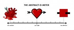
The Abstract-O-Meter
Netflix’s new documentary series; Abstract: The Art of Design, takes you inside the minds of eight designers representing different fields in the industry.
Episode 1 profiles Christoph Niemann, an illustrator who’s work has appeared on the covers of The New Yorker, WIRED and The New York Times Magazine. A highlight for me was Niemann’s explanation of what he calls ‘The Abstract-O-Meter’; each idea requires a very specific amount of information. Sometimes it’ requires a lot of detail/realism, other times it requires only very few details. Either way, each idea sits somewhere on the abstract-o-meter scale.
The illustration of a heart to symbolise love is used as an example:
When you illustrate the heart as just as a red square (the ultimate abstraction), no one knows what you’re talking about so it totally falls flat. On the other other extreme, when you take a hyper-realistic approach and draw an actual heart made out of flesh and pumping blood, it’s so disgusting that the last thing anyone would ever think about is love. Somewhere between that abstract red square and the literal, hyper-realistic image of a heart is the graphic shape that kind of looks like each and is just right to symbolise love.
Leading Design Conference
I spent three fantastic days in London for Leading Design Conference last week. The speakers and workshops were superb, and I met some lovely folks. I arrived home with a pages of notes to sort through, here are a few of them:
On creating a successful working environment
A great studio is a place where:
- Ideas and knowledge are shared
- Everyone is pushing each other to be their best selves
- You can draw on walls
- People regardless of rolls can collaborate and contribute to great design
Make design and research insights visible. The more you share, the more people ask questions and care.
Inspire people with your workspace. Tell stories around your work space.
Leadership
A design leader’s job is to design the design, whatever that takes in an organisation. It may be educating others in the organisation or hiring more designers or changing the workspace etc
As a leader, model the behaviour you wish to see. What effect are you having on others?
Leadership is the ability to clearly communicate a vision of the future others want to follow.
Communication
Our job is not just to design, but to design and sell the vision.
Be a ‘Worxtrovert’. You may not love to be an extrovert at work, but you have to be.
Take the time to take your design work and translate it for the business people, otherwise they won’t see the value in it.
You need to be insanely proactive in sharing what you do. People are busy and you can’t assume they will find what you’ve done.
Accountability
Accountable = Influential
Be accountable. When something isn’t right:
- Acknowledge reality
- Own it
- Seek assistance
- Make it happen
Designing
Design like you’re right, test like you’re wrong. (Ie. Design with intent)
At each stage, ask about customer goals as well as business goals.
As designers we fall into the trap of trying to make big changes. Look at how you can make small improvements in the right direction.
Career development
For each role you have fill in:
- Who/what it impacts:
- Responsibility:
- Effect I want:
- What success looks like:
- What happens if I don’t do this:
How do I think about the long term for myself and my team? Start small by considering the next 6 months.
Knowing your organisation
You need to be invested in knowing the business if you want to be a leader. Then you can have a seat at the table.
Understand how decisions are made in the company
What’s your organisation’s sense of purpose?
Build influence and trust.
Presenting/Meetings
Presenting the solution straight away can be disorientating to the stakeholder, like a slap in the face. Start by presenting the problem and let them absorb it. Plant the seed through several communication points.
When presenting to stakeholders, it’s unproductive to have the mindset ‘is it good?’. The decision maker is thinking ‘is it right for us?’ They assume it’s good as you’re the professional designer. That’s your job.
Bring design to life by telling stories through your prototypes.

Designing Twitter Video
I’ve just read this fantastic in-depth case study on the design process behind Twitter Video. It’s a great insight into how the team work and the importance of quick prototyping, user testing and the willingness to iterate. Read it here.
“And of course one thing’s for sure: putting a real prototype in front of your team is the best form of communication.”
“A prototype is worth a thousand meetings.”
“The details are not the details. They make the design.”