Building stronger teams for better user experience
Last night’s Cambridge Usability Group talk on UX Leadership was presented by Lily Dart, a freelance user experience designer and user researcher based in London. Below are my notes:
User experience is a team sport
Many aspects, job roles and decisions go into a user experience:
- Front-end developers
- Back-end developers
- Designers
- Product managers
- QA’s
- Customer services
- and many more…
“Too many people view management as leadership. It’s not. Leadership comes from influence, and influence can come from anyone at any level and in any role.”
There is no hierarchy in leadership.
Empathy
Empathy in leadership is important, when there is no empathy there is lack of commitment. Consider colleague needs as you would user needs.
Direction and focus
A good leader sets direction and focus, they communicate goals not details and explain why goals are important. When there is no direction and focus you get conflict as everyones’ personal opinions seem equally valid on the surface level.
Teams work best together when they have a clear vision that everyone can work towards
Set goals for your work and define metrics to measure success. Issues often occur as team members have a different idea of what ‘good’ looks like.
Collaboration
A good leader facilitates collaboration, when there is no collaboration you get a blame culture. Good collaboration means communicating in a way that everyone understands.
When you admit mistakes, colleagues seeing you’re capable of telling the truth.
Helping your team to work towards the same goal isn’t about writing more documentation.
Instead of pre-empting and correcting mistakes in advance, let people mess up to create autonomy and a sense of purpose.
Recommended reading
Reinventing Organizations: A Guide to Creating Organizations Inspired by the Next Stage of Human Consciousness by Frederic Laloux
The Five Dysfunctions of a Team: A Leadership Fable by Patrick M. Lencioni
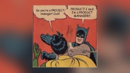
Same But Different
Jock Butussil gave a talk on product management and UX design to Cambridge Usability Group last night. Here are my notes:
My notes
The product is a means, not an end. How successfully are users achieving what they want to achieve?
The product isn’t the important thing, it’s to help users achieve goals.
A product manager aligns teams who may have conflicting needs and pull in different directions.
Align everyone to the shared product vision and make it matter to motivate the team.
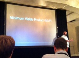
MVPs should be valuable and useful and feasible.
Use evidence to decide which features to work on.
Product management = what and why
UX = how
[these two often cross over in my experience – J]
Share user needs and metrics.
Recommended reading/viewing
The Practitioner’s Guide To Product Management by Jock Butussil
Inspired: How To Create Products Customers Love by Marty Cagan
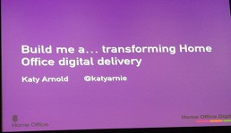
Build Me a Portal by Katy Arnold
I really enjoyed last night’s Cambridge Usability talk by Katy Arnold, Head of User Research and Design at The Home Office. The talk covered the journey that Home Office Digital is making as they transform the way they provide services for citizens around the world. The UX team started small – they didn’t even have a dedicated space in the office. Katy shared the challenges the UX team faced in a risk-averse organisation, not only the design itself but getting those higher up in the company to see the value of user research and design.
The hardest thing about design or research is rarely design or research.
Talk to as many [users] you can who know the local environment.
It’s not about Digital Design anymore, it’s about Service Design.


Nielsen Norman Group Usability Week
I recently attended Nielsen Norman Group’s Usability Week in London. The five day course was packed with great insights and useful take-aways, much of which revolved around usability, a fundamental building block of our craft. Here’s a brief summary of the week.
Days 1-3: Interaction Design
The first three days focused around the principles, processes, and techniques of Human-Computer Interaction. It was exciting to taught by Bruce “Tog” Tognazzini, a UX pioneer who developed Apple’s – and the world’s – first standard human interface for personal computers. I first heard about Tog after reading his brilliant Apple Watch predictions article back in 2013.
The course alternated between lectures and workshops, covering a wide range of topics on HCI. Topics included:
- Principles of interaction design
- Information Theory
- Fitts’s Law
- Organisation structures
- Increasing the power and visibility of HCI in an organisation
- Gathering requirements
- Interviewing clients
- Shadowing workers
- Design principles
- Prototyping techniques
- Usability testing
I found the workshops particularly useful; the class was divided into small groups and tasked with designing an application for casual pilots. It involved interviewing clients, writing user scenarios and testing prototypes with users to come up with a solution.


Day 4: Scaling User Interfaces
The Scaling UI seminar discussed design similarities and differences across platforms and analysed the usability of many popular responsive-design patterns. I’d have preferred more focus on smart watches and smart TVs rather than standard tablet/mobile/desktop which most of the day was focused on. However, the workshop exercises and usability testing videos we were useful – highlighting potential mistakes and misunderstandings users have when using mobile UI. Topics included:
- Behavioral differences between devices: desktop, tablets, and phones
- Cross-platform and platform-specific principles
- Designing for a continuous experience across multiple devices
- Scaling interaction techniques for different devices, while maximising consistency
- Dealing with desktop features that don’t work well on other devices
- Information architecture
- Prioritising content
- Responsive-design patterns and their usability


Day 5: The Human Mind and Usability
On the fifth and final day, we examined the psychological, social, and behavioural influences on how people take in information, process it, and retrieve it later. Using psychology as a foundation, we looked at a number of methods for using these concepts to overcome design problems and understand how users think. Topics covered included:
- Human abilities and limitations
- Attention
- Visual perception
- Memory and knowledge
- Strategies for information retrieval
- Mental models for predicting interactions and outcomes
- Problem solving and decision making
- Social psychology
- Emotion-driven behaviour


UX Certification
I passed five exams the following week (one for each day of the course) to earn my Nielsen Norman Group User Experience Certification 🙂

Conclusion
It was a fantastic week. The seminars and workshops were informative and entertaining – I learnt lots and met some great people along the way. With over 1,000 slides and 16 pages of notes – I look forward to implementing what I’ve learnt in my work.

The Future of the City
Here’s a brief write up of a CamUsability talk I attended yesterday evening about the future of cities given given by Sjors Timmer at Microsoft Research.
Introduction
Why do we talk about the future in the singular, when at any moment in time there are many futures to consider? When we look at corporate visions of the future of our cities, we are shown a clear path towards the Smart City. But is that true?
Sjors discussed the Urban IxD Project, which experimented with ways to break through the monolithic vision of the future city and create a much wider range of possible urban futures. He showed how their method of critical design and design fiction was used to explore different futures.
Past visions of the future
In 1939 there was a New York exhibition called Futurama that presented a model of the world 20 years into the future (1959–60). Sponsored by the General Motors Corporation, the installation was characterised by its automated highways and vast suburbs. This would have been very appealing at a time when cars were relatively new and novel.
Looking back years later, we can see that this once-aspirational vision of the city was remarkably accurate. However, now that traffic is ubiquitous, we know the downside of this. We can’t build our way out of traffic.
Corporate visions of the future
We watched several corporate visions of the cities of tomorrow, such as ‘Intelligent Operations Center’ from IBM, ‘Smart City Barcelona’ from Cisco and ‘Intelligent Cities’ from Philips. Although technically advanced, the language of the companies was extremely functional and devoid of any human emotion – ‘efficiency, smart, resources, systems’ etc. No one seemed to be talking to the people living in the cities.
Urban IxD Summer School
The Urban IxD Summer school was formed to produce fictional concepts and suggestions for Urban IxD using Critical Design and Design Fiction.
Urban IxD is the artful integration of people, place and technology.
Critical Design uses speculative design proposals to challenge narrow assumptions, preconceptions and givens about the role preconceptions play in everyday life.
Design Fiction uses a fictional frame to make an argument about a potential future by demonstrating that future in a context that a large public audience can understand.
What was made?
We were shown a couple of the videos produced at Urban IxD school. You can find all the projects’ videos and background stories on the school’s website. The projects were thought-provoking, but there is still much to be explored.
After the talk, we discussed how Urban IxD could impact governmental and social change: How would shared decision making work in future cities? Would privacy be an issue? How would different cities use technology? Can Urban IxD improve care for the elderly? Could Urban IxD encourage people to live healthier lives?
Here’s to the future!
Bridging the Physical-Digital Divide
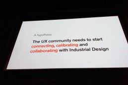
I attended an interesting Cambridge Usability talk by Jason Mesut last night, exploring how individuals and teams in the User Experience and Industrial Design community can connect, calibrate and collaborate to work towards a common purpose. It highlighted the current divide that exists between the two communities and the importance of future collaboration.
“I want a future where physical products and digital services work in harmony”
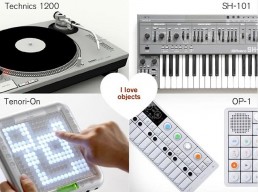
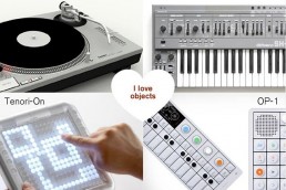
The Joy of Tactile Controls
DJ and electronic music equipment is a great example of a good physical-digital experience. It feels really satisfying to control digital sounds using good old-fashioned knobs and dials. You feel much more connected to the interaction and the product leaves a lasting impression – unlike many apps. Seeing these cool gadgets really made me want to get my old vinyl decks and keyboard down from the loft and start playing again!
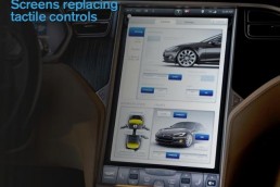
Screen Domination(!)
Screens are now everywhere. Many companies are jumping on the screen bandwagon without thinking the UX through first – just because it’s the thing to do (and cheaper most likely). Take the 17’ Tesla car touch screen for example. This is dangerous – drivers need tactile controls so they can keep their eyes on the road.
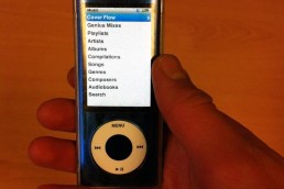
Another example that comes to mind is the iPod Nano. Personally, I found it much more useful when it still had the button and wheel control as I could control it whilst running and wearing gloves. That’s why I’ve held onto my good ol’ faithful 5th Gen Nano for so long. Touch screen isn’t always the way forward!
They don’t make ’em like they used to 🙂
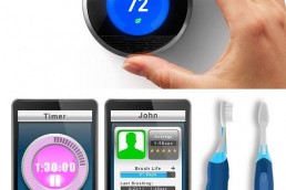
Hardware Revival
In contrast to this, there is a slow hardware revival – some good, such as the Nest thermostat, and some, well…a little odd, such as the Beam Toothbrush. Is this really the best use of technology?
Why Harmony is Rare
Unfortunately, good examples of physical-digital harmony like Nest are rare. There is generally a hardware/software mismatch. Digital natives seem to be driving the future whilst Industrial Designers have their heads in the sand. Why is this? Mesut gave a few reasons:
- Hardware is being commoditised
- Delivery timelines are different
- Disciplines don’t understand each other
- Teams are separated
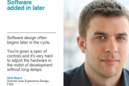
An example of the latter point: The Fitbit UX Team had to compromise their work for the limiting hardware created previously. If the two teams had worked together from the start, the product experience would have likely been much better.
How can we bridge the divide?
Bridging the divide is a tough challenge but it has been done. We must:
- Connect: Find common ground and respect differences.
- Calibrate: Adapt ourselves, process and translate our language.
- Collaborate: Unite on a common purpose, share between teams and prototype together.
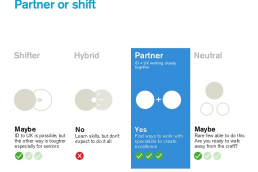
We explored different ways to unite the UX and ID disciplines. Partnering teams seemed the most practical way to do so. It’s unlikely that one person would have specialised skills in both UX and ID. Teams working together would prototype together, and share work regularly.
Unite on a common purpose
It was a great talk which brought Industrial Design processes and practices to my attention. From seeing the examples of when it’s done right, it’s clear that collaboration between UX and ID designers improves the product experience massively. Let’s see what the future holds!
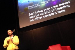
The talk ended with a rave analogy I liked:
“Different tribes coming together, dancing to one beat in the same room for a common purpose. Just bring you own style and be careful on treading on other people’s toes.”

Slippy UX
This blog post from UX Magazine outlines some UX predictions for 2015. Amongst the predictions is a rise in “Slippy” UX, ie. designing non-distracting interfaces with glance-ability in mind, for use in potentially high-stress situations such as driving.
Despite the silly name, Slippy UX makes sense. Using home automation as an example, nobody would want a house that is constantly interrupting them. It’s the opposite, “a truly successful connected home would operate without even being seen. Once set up, it would deliver seamless service and an experience that enhances other, analog activities: laundry, sleeping, comfort, conversation”.
Wearable device UX design will also likely follow this pattern as screens get smaller/disappear completely. Our reliance will shift toward non-graphical UI such as auditory and haptic interactions. As this study points out, the development of graphical user interfaces is a well-studied and understood area but most people are much less familiar with the specialised constraints and opportunities inherent in the use of the haptic and auditory senses for human-computer interaction. It will be an interesting and exciting challenge for UX designers!

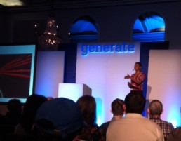
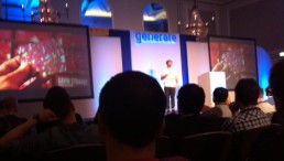
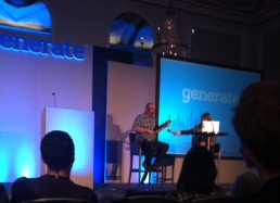
Generate London 2014
I attended Generate London last month – a conference for web designers and developers, presented by net magazine and Creative Bloq. Here’s a brief summary from some of the talks.
White Space Creativity by Denise Jacobs
Denise talked about ways to get into the creative zone and channel our creative power.
- Reduce noise and clutter – ie. distractions. When we’re in the creative zone we’re focused inwards. Noise and clutter makes us focus outwards. These distractions cause lots of ‘unclosed loops’ and make us think we’re being productive when really we’re not.
- Relax by breathing, spacing out, mindless activity, laying down, day dreaming, taking showers, walking, laughter, playing and having fun. (Probably not all at once)
- ‘Listen to your genius’. It takes the pressure away from you if you frame your ideas coming from another invisible genius whispering you ideas.
Ideas are Easy, Implementation is Hard by Chris Murphy
People have ideas all the time but few actually go on to implement them. Chris told the story of how he worked with two of his master students on Get Invited, a social ticketing app he had on a napkin years beforehand. Chris is an advocater of the Lean Startupapproach and it was an amusing insight into the conception and development of the product and its many iterations.
- The idea doesn’t mean anything whilst it’s on the napkin.
- Keep the product focus
- If you’re not embarrassed by the first version of your product, you’ve launched too late.
- You need to ship and learn. (The early examples of Get Invited were extremely basic)
- Your product needs to be 10x better than the competitors because people can’t be bothered to move.
- Focus on appealing to innovators and early adoptors.
Graft, Craft and being Daft by Gavin Strange
Gavin‘s talk on the importance of personal projects was the highlight of the day. He doesn’t like the clear boarders that job titles can give designers – UI, Branding etc. Job titles are only mental constraints – it’s all making stuff at the end of the day! Personal projects are a great way to expand our skillset, have fun and create opportunities.
- Be a Jack of all trades, master of none. Or ‘Polydisciplinery’ if you want to sound fancy.
- Say yes and be open to opportunities (or create them).
- The reason we struggle with insecurities is because we compare our behind the scenes struggle with everyone else’s highlights reel.
Dan Celderholm
Following on nicely from Gavins talk on personal projects, Dribbble creator Dan talked about the start of Dribbble. He created it in pubs and coffee shops after work as a side project before it got as big as it is now. He went on to play the Banjo for a bit, talk about CSS and SASS, then play the Banjo some more.
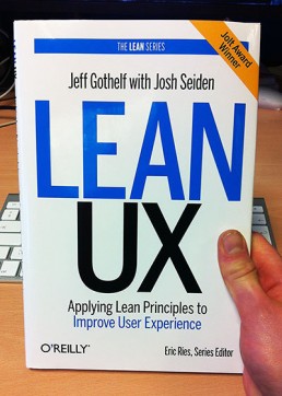
Lean UX
I’ve just finished reading the brilliant Lean UX which overviews key Lean UX principles and gives advice on how to incorporate them into an agile development environment. Building upon the fundamentals of The Lean Startup, Lean UX encourages teams to move away from heavily documented handoffs to a process that creates only the design artefacts needed to move the team’s learning forward.
Being relatively new to agile, I found the ideas, case studies and guidelines helpful and practical. A lot of ground is covered such as collaboration with other team members of the product team, gathering feedback early and often and designing in short, iterative cycles.
Section 3 was particularly interesting. It tackled the integration of Lean UX practices into an organisation and the shifts needed to take place for the ideas to truly take hold. Common designer concerns were addressed, many of which I can relate to:
“For some designers, Lean UX threatens what they see as their collective body of work…“version one” of a project, and other low-fidelity artefacts are not the makings of a “killer portfolio,” but all of that now is changing.
Although your organization must continue to value aesthetics, polish, and attention to detail, the ability to think fast and build shared understanding must get a promotion. Designers can demonstrate their problem solving skills by illustrating the path they took to get from idea to validated learning to experience. In doing so, they’ll demonstrate their deep worth as designers. Organisations that seek out at and reward problem solvers will attract – and be attracted to – those designers.”
In summary, Lean UX is a great overview of what an effective Lean UX process should look like. There’s a good balance between theory, practical advice, and case studies with many takeaways that I will experiment with in future projects. Highly recommended.
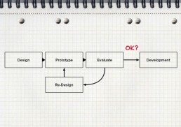
UI Prototyping - The Power of Show, Tell & Experience
This post was originally written for my colleagues to give insight into the UX team’s process.
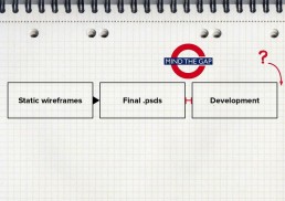
A challenge we face when designing a new interface is how to “show” the interactions and animations that bring our designs to life in an effective way. The static .psd mocks and wireframes in which we used to rely are no longer good enough. The screens we design now need to adapt to multiple resolutions, be tapped, pinched, swiped, zoomed, and more. Our interfaces must be alive, transitional and reactive to fingers.
The ‘Traditional’ process
Before incorporating prototyping the process looked something like this:
- The designer would create every state possible in pixel perfection along with some annotations of how it was meant to work.
- The designs would then be passed over to the developers to interpret and develop.
- The final product was produced and tested in context. Any design related bugs were scheduled for the next release.
This process worked but static images often leave gaps communication. These gaps resulted in lots of back and forth questioning, missing details and misinterpretation, which is bad. Another issue was that static image files aren’t good indicators of what a design’s going to be like to actually use – especially in the context of multiple devices. Something could look great in Photoshop but be difficult to use on a small mobile screen and we wouldn’t find out until it was too late. We realised there had to be another way. And that’s when prototyping entered our workflow.
Including prototyping into our workflow
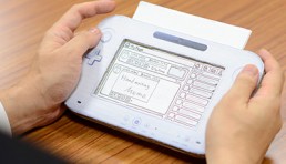
A prototype is a representative model of the final system and can range from rough paper sketches to interactive simulations that look and function like the final product. Unlike static .psds and annotations, prototypes go further than show and tell – they actually let you experience the design. All the time and frustration spent trying to communicate interactions can be cut out by simply showing what you mean. If a picture is worth a thousand words, then a prototype is worth ten thousand.
It’s early days but, so far, we’ve found incorporating prototyping into our workflow to be very beneficial. Here are some of the key benefits:
- Quick iterations. Design is an iterative process. Prototyping allows us to experiment with and review multiple approaches and ideas quickly.
- Designs can be tested in context. Experiencing user-flows on the right device lets us see first hand what works and what doesn’t before committing to a design.
- Catch mistakes early. Prototyping helps catch mistakes early in the design process before they are passed onto development.
- Focus. Prototyping produces more focused products by concentrating on the user-flow rather than just the visual design.
- Reduces misinterpretation. Prototypes let people experience how a product will work, rather than just read about it. Words leave too much room for misinterpretation.
- Reduces risk. All the above reduces risk and avoids missed requirements, leading to a better design faster.
Different types of prototype
Broadly speaking, you can class prototypes into one of the fidelity categories below. Fidelity refers to how closely a prototype resembles the final solution. The fidelity we use depends on the stage of the design process and the goals of the prototype.
Conclusion
Hopefully, this article has helped you understand more about prototyping and the benefits it can bring to the design and development workflow. We still use Photoshop but not until much later on in the design process.
Low fidelity prototypes
Low fidelity prototypes are really quick. Not designed to wow people but to depict and explore concepts and flow options. By removing the bells and whistles associated with high-fidelity prototypes, we strip our concept down to the core. Users aren’t distracted by the visual design and more focused on the core interactions/flows.
Medium fidelity
Medium fidelity prototypes take more time and effort but look more formal and refined. They’re better suited for testing in context to determine whether user needs are met and whether the user experience is optimal in the different contexts. You deliberately don’t want it to look too polished though as you’re not after feedback on the visual design at this stage (debating over button colour) but on the actual user flow and experience – ie. How easy it is to accomplish a task? People also tend to find it easier to give feedback on something that’s clearly still a work in progress.
High-fidelity
High–fidelity prototypes are the most realistic and can sometimes be mistaken for the final product. They are usually time-intensive to produce but they’re good for getting a true sense of how a design will work and making the final refinements.

Conclusion
Hopefully, this article has helped you understand more about prototyping and the benefits it can bring to the design and development workflow. We still use Photoshop but not until much later on in the design process.