Hidden symbolism in logo design
I love clever logos that have subtle, deeper meaning. Below is a compilation of 40 creative examples of logos compiled by plastic card maker Oompa that portray some sort of “hidden message” . Have you spotted any of these hidden messages before? If not, I’m sure you won’t forget them once you see them!
You can view the full size image here (via Ad Week).


The beautiful Rolls Royce Wraith
I had the exciting opportunity to take a look at the stunning Rolls Royce Wraith this weekend. I’m no petrol head but I couldn’t help but fall in love.


The attention to detail on the exterior and interior is awe-inspiring.

The fibre optic lights on the interior roof give off a gentle atmosphere. Owners can personalise them to any constellation they please.

Each car gets its own tree to ensure the grain matches throughout the interior and that each area ages and colours at the same pace.
Rolls-Royce select bulls raised in fields free from mosquitos and barbed wire, so there can be no scratch marks.

It’s surprising how quietly the engine runs. I didn’t go for a drive but am assured it’s fairly quick!

Guess I’ll start saving…
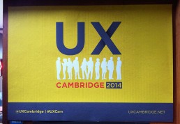
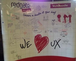
UX Cambridge
I attended my first UX Cambridge conference last week. I learnt lots and met some great people. Below is a summary of the talks and workshops attended over the three days.
Key takeaways from the conference:
- If a solution does not solve your user’s problems, it will not solve your company’s either. We need to focus on user needs, considering the possible scenarios and contexts.
- User experience is the sum of interactions between people, devices and events. Interactions don’t just happen on the screen – designing an experience covers all areas of the customer journey. Design between the screens
. - UX represents the conscious act of coordinating interactions we can control, acknowledging interactions we cannot control and reducing negative interactions. Although there will be factors we have no control over, we can acknowledge them and plan ahead to reduce negative interactions.
Describing the Elephant – Eric Reiss, FatDUX Group
The conference kicked off with a keynote by Eric Reiss, of author of several books on usability including Usable Usability. Reiss expressed concern that UX designers are in danger of alienating businesses by bombarding them with geek speak (empathy maps, user stories etc.) Businesses may realise that UX is important but do they really know what’s going on?
When UX design is segmented into many ‘silos’ (IA, IxD, GD etc.) can a single person truly be a UX designer? Eric claims not – no single person can truly be a “UX Designer” and no single discipline can truly take ownership of UX.
Five things Eric asks us to consider if we want to succeed at UX:
- Don’t speak geek
- Don’t attack other disciplines (SEO, MKT, IxD etc.)
- Solve problems. Don’t create them.
- Think beyond your own self interest.
- Sell crackers, not crumbs (ie. the full solution)

Experience at the edge of the network – Alberta Soranzo, Friday
The second talk of the day covered the topic of ubiquitous computing – how can we ensure a seamless user experience across multiple devices and contexts? Alberta gave an example of the disconnect between a person browsing for a product online and then heading out to purchase the product from the physical store. The “edge of the network” is the shift from PC to store – the store has no way of knowing what you’ve been looking at and you don’t know where the product is in store.
We looked at Beacons as a possible solution. Beacons are small tags that create a connection between the physical and digital world. They can be stuck anywhere in a shop, museum or any public place, can talk to a corresponding app on your smartphone and accurately work out where you are. The app can then communicate with you accordingly (giving product information, offers, directions etc.) It’s an interesting technology, but seem like they’d cause more of an annoyance than anything else – notification overload!
“Seamless” is a shallow metric for UX success – Simon Bostock, Equal Experts
Simon questioned whether there’s always a good reason for seamless interactions. He argued that seamless interactions cause “blissful ignorance” for users, “It just works” is great in some cases but it’s not a good foundation for a civil society.
When our smartphones automatically back up onto the cloud, do we know understand who’s storing our data and the potential consequences? Does Amazon one click make us spend more unintentionally? The talk raised some good points. As technology becomes more integrated into our lives, I’m sure this is a conversation that will be raised again and again.
Mobile UX in a Multi-Device World – Leo Poll, Akendi
This hands-on workshop was the highlight of the first day for me. Leo began by asking “What is a user experience?” We discussed how there are many different steps for a user as they go from customer to client and (hopefully) repeat customer. If you design a customer journey for just one device, you’re missing out on the bigger picture – you need knowledge of not only the tasks at hand, but the whole sequence of ever changing steps and contexts.
As an example, we looked at the customer journey of buying a car – from initial research to test driving, further research, purchasing, servicing etc.
Designing the user experience involves designing both the tangible and intangible aspects of the customer journey.
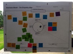
After the talk, we got into small groups to create an Experience Map to redesign the UX Cambridge experience. Experience Maps are great way to uncover what users need at different phases of the journey and how to meet them. Many post-it notes were used! After we had done, we stuck our work on the wall and discussed our outcomes.
Do I have your Attention? – Chris Atherton, Equal Experts
Day 2 got off to an information-packed start. Chris’s talk was about getting people’s attention and keeping it. She explained that although it’s easy to get someone’s attention (add something new, movement etc.), keeping attention is difficult.
Think about how much information you’re asking users to retain. Complexity leads to increased cognitive load and resource depletion. Therefore, designers should use chunk information and pair things down to their simplest elements (avoid excess colour, shapes, icons etc.) to make things as comprehendible as possible. Remember that the eye cannot concentrate on lots of little details.
We should be extra careful with first time users – ensuring we don’t throw too much at them at once. Being a novice is a lot like being stressed (cognitively). Their working memory goes and they lose focus. A screenshot of two different Skype apps demonstrate an app with high confusion potential. On comparing Skype on iOS to Skype on OSX – the two look like totally different products.

The Dirty Word of Design: Management – Alisan Atvur, California College of Arts
Alisan shared ways for managers to establish, maintain and evolve empowering relationships with their team members. He advised team members to build a career aspiration map so managers know how to properly nurture them and gave advice on how to facilitate design critiques.
“We end our careers with two things: Artefacts and relationships”
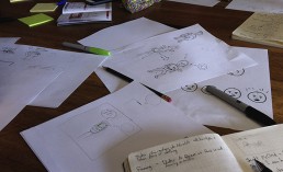
‘UX Comics: Make Your First Comic’ – Bonny Coalville, Rockpool Digital
The afternoon workshop with Bonnie highlighted ways that UX Comics can benefit a project. After a brief talk on the subject, we had a go at creating our own. When backed up with user research, UX comics can be powerful – they engage, bring things to life and encourage dialogue. They are great at conveying non-verbal communication, such as thoughts and facial expressions. Just because they are novel, doesn’t mean they’re not useful!
The Road Less Travelled – Mike Atherton, Independent
Mike’s talk was about how he “got his groove back” after becoming disenchanted by UX. The talk opened on the importance of having a focused brand. Businesses often get caught in the trap of thinking more features = better product. The “Featuritus Curve” says otherwise – it plots how user happiness peaks after certain number of features before steeply declining as more are added, over complicating the product. The take away? Have focus! Know why you’re doing what you’re doing.
“A simple and beautiful UX is the hallmark of a company in touch with itself”

‘Involving Stakeholders in UX Research’ – Revathi Nathaniel, Red Gate
Revathi’s talk started by outlining her user research process and how she involves others along the way. The three stages were: Plan, execute and analyse (repeat). The advantage of collaborating in user research is that data can be interpreted in many ways – discussing it helps. We covered techniques for each stage and got tips on involving other team members.

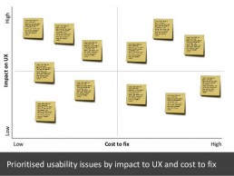
‘Pursuit of Tappiness’ – Neil Turner, Freelance
This was a case study to how Neil and the TUI UX team make the Thomson holiday booking website tablet friendly. It’s always interesting to see how others go about their work and obstacles they face along the way.
Due to the website’s size, it was not practical to start again and make it responsive. Therefore, incremental changes to the existing site were made in small steps. Neil shared advice on creating a tablet strategy, user research, prioritizing usability issues and user testing.
“Changes to sites so widely used should happen in small steps so not to confuse users – people don’t really like change.”
“Without a strategy the organization is like a ship without a rudder, going around in circles.”
Joel Ross and Michael Kami
‘Designing to Disappear’ – Malin Maki, Fjord
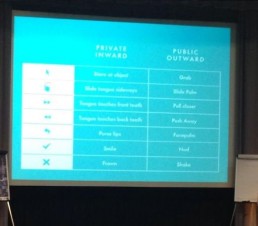
As the internet merges with the real world, technology is gradually meeting biology, and we’ll soon be connected way beyond mobile, computer, tablet and TV. Malin’s talk explored the future of interface design and questioned the skills designers will need as we move away from visual interfaces. The talk was primarily focused on the work she did for Emotiv, a product that allows paralysed people to control their surroundings using their brainwaves – fascinating stuff!
‘Father Christmas, the Tooth Fairy and Disabled Users. Why none of these three actually exist’ – Paul Brooks, PRGX
The final talk of UX Cambridge got off to a great start as Paul handed out chocolates to everyone. He argued that disability is not black and white and encouraged us to consider the a spectrum of abilities.
“A person does not have a disability, external things disable them”
Conclusion
So that was UX Cambridge in a nutshell. Thoroughly enjoyable and well organised. I look forward to the next one.
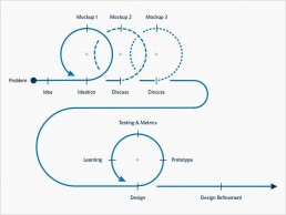
Design process infographic
A nice info graphic outlining the design process. It highlights the importance of exploring different options, team discussion and reiterations to ensure the design is fit for purpose and a pleasure to use.
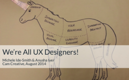
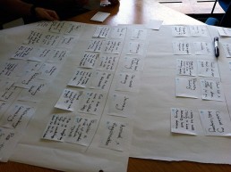
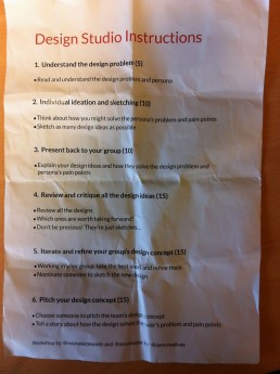
Workshop: We Are All UX Designers
Last night I attended a CamCreative UX workshop given by Michele Ide-Smith and Anusha Iyer. The event was popular – with 60 attendees in a relatively small coffee shop it was a lively atmosphere.
In teams of six, we worked together on a UX project aimed at reducing a family’s food waste. To begin, we were handed a persona describing the user – Joanna, a 36 year old mother of two – and the problem to be solved:
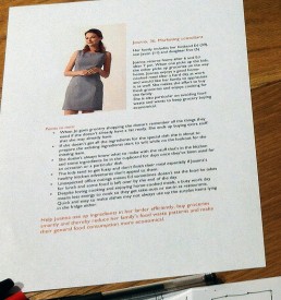
‘Help Joanna use up ingrediants in her larder efficiently, buy groceries smartly and thereby reduce her family’s food waste patterns and their general food consumption’.
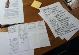
During the evening we tried out the ‘Design Studio Method’, a creative technique which helps teams explore a problem their customers are experiencing and come up with innovative design solutions.
In a short space of time we generated lots of ideas in a visual format and worked collaboratively to come to an agreement on how to solve the problem. We had to think on our feet, and come up with lots of ideas (no matter how crazy)!
Ideas included: a new way to order food online (a calendar view where you order meals, not items), a Food Dashboard (monitoring how much of each type of food you have left, upcoming use-by dates and suggested recipes), a service that sends a goat round to eat your leftovers (why not?) and a bin that gets angrier the more waste food you put in it (could happen). We also looked at how the experience could be made fun and rewarding by adding gamification and an element of social competition – a topic covered in the book, Seductive Interaction Design.
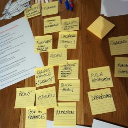
Lots of post-it notes were used!
I was reminded how productive it is to sketch lots of ideas in a short time period combined with collaboration is at creating and developing new ideas. By combining your ideas with others’, solutions are discovered that wouldn’t have been found individually – it’s more fun too!
When working on your own it’s easy to get too involved in one idea rather than try many out. It’s also easy to lose perspective of the problem the design is trying to solve.
‘If you’re a UX Designer working on your own in a corner, something’s not right’
Another takeaway was the power of stories and narrative. The most powerful presentations were those that told the story of the user. Some groups acted out scenarios to demonstrate how the design would fit into the user’s life. UX comics are a great way to communicate a narrative on paper.
Overall, it was a fun and informative evening and I look forward to the next one!
Cheeky EasyJet!
Here’s an example of ‘Dark UX‘ I came across today on the EasyJet site. It caught me out anyway…

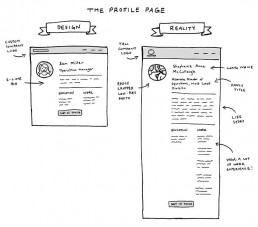
Imagined Content vs. Real Content
I couldn’t help but smile in recognition when I saw the illustration below.
As designers, we consider the core actions a user can take and how these flows and journeys work but there are always elements or features that may get overlooked.
This article explores five potential “blind spots” that we may overlook during the web app design process.

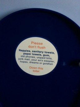
Even toilet seats can have great copy...
I saw this witty little notice on an East Midlands train travelling back from Nottingham last weekend. I love that:
a) Someone thought of it, and
b) It was approved
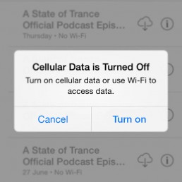
Simplifying an iOS User Flow
To save iPhone battery-life, I generally leave my cellular data switched off – only turning it on when needed. One slight frustration though, is the number of steps it takes to active cellular data on iOS7:

From the ‘Cellular Data is Turned Off’ modal you have to: Press ‘Settings’, which takes you to the main settings page. From there you have to navigate to the cellular data settings page to turn on cellular data. You then have to navigate back to whatever you were doing…phew!
Would it not just be easier to have an option to turn on cellular data on the modal like so?:
Perhaps Apple added multiple steps to this user-flow deliberately, to stop you from accidentally turning on your 3G during a flight for example. Even so, would this not be a better solution?:

The Settings button takes you directed to the cellular data settings page, bypassing the main settings page.
Anyway, just thinking out loud. I’ll step off my high horse now.