The 14 Hour Workday
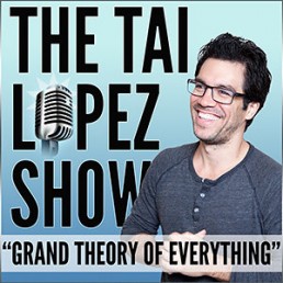
I’ve just finished listening to 14 hour Workday by Tai Lopez where he talks about the importance of putting the hours into work you’re passionate about and diminishes the mirage of the 4 Hour Workweek (which is a great book, with solid content – just a misleading title).
This talk should be part of school curricula everywhere; it’s inspiring and a refreshing change from the ‘get rich quick, with minimum effort’ mentality that often gets thrown around. Worth a listen.
UX talk - The Internet in your Pocket with Alberta Soranzo
I spent Thursday evening at an insightful UX talk: The Internet in your Pocket with Alberta Soranzo, director of UX at Friday.
Focused primarily on information architecture the talk covered the thought process that drives mobile content strategy, the specific challenges and opportunities of the mobile space and how information architecture and content strategy contribute to the creation of outstanding cross-channel experiences.
Some notes from the talk:
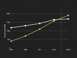
Mobile usage is rising.
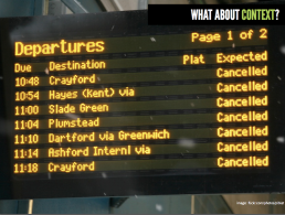
As designers, we must consider context. We need to give the user the right info at the right time – are they at a train station, stressed out and running late or are they in a relaxed state with friends, searching for a good cafe? We must eliminate the user’s anxiety from performing a task (especially one that’s unfamiliar).
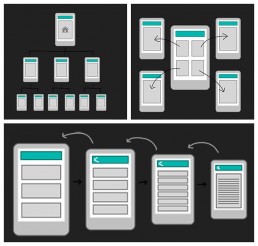
We looked at several different navigation structures for mobile websites. Each has pros and cons and the one to use depends on the individual site. They can be combined together when relevant.
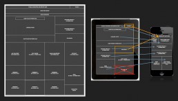
We should design for content, not vice-versa. The content should have a strong structure and be independent of the presentation layer.
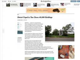
The homepage is no longer the first place someone visits (due to direct links on social media etc.). It is now a brand statement rather than a calling card. With this in mind, all NY Times pages allow the user to navigate around the site as if you were on a homepage.
How Snapchat Onboards Users
There are some really nice touches to Snapchat’s onboarding process. You can view the full Snapchat onboarding process (and many others) here.
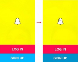
The logo sticks its tongue out at you when you tab ‘Sign up’. How can you not be won over? 🙂
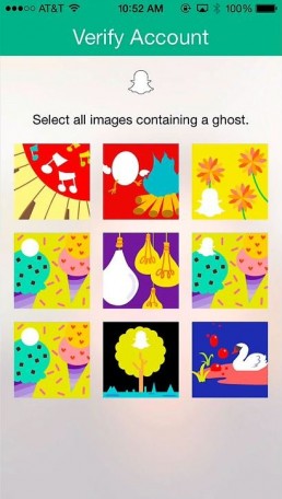
This ghost finding mission is a fun alternative to the traditional CAPTCHA (which are the opposite of joy to use).
Trends in UI, Interaction, & Experience Design
‘[Our designs] can be enabling or disrupting’
A fascinating documentary on User Experience and Interaction Design.
3 bits of advice every twenty-something needs to hear
A provocative TED talk given by Clinical psychologist Meg Jay. She gives 3 pieces of advice for how twenty-somethings can re-claim adulthood in the defining decade of their lives. The talk starts off on the topic of relationships before moving on to career, social life, personality and life goals. One quote that stood out for me in this talk is one by Leonard Bernstein:
“To achieve great things, two things are needed: a plan and not quite enough time.”
That one certainly rings true for me when designing (and most other things thinking about it). There’s nothing like the drive of determination you get working on a project who’s deadline is just that bit too tight.
LG explains its UI for the G3
A really nice video by LG explaining the GUI for their latest smartphone, and the reasoning behind it. I love the graphical style of the video – it certainly makes a nice change from the overly mimicked style of Apple product videos. Very impressive.
Material Design
Material Design is Google’s new visual look for Android, Chrome OS, and more. The new look includes splashes of color, refreshed iconography, typography, and a more consistent interface hierarchy. The entire interface is based on what Google calls a “unifying theory of a rationalized space and a system of motion.”
I love that it’s based on paper, the motions and transitions make sense. The guidelines are fantastic and Android L is shaping up to be the best looking release yet. I’m looking forward to seeing how it’s implemented – it looks great on mobiles, but not sure how much it will catch on on the web. Time will tell!
On pricing
“A client recently asked me if I could design a cheap logo (for a restaurant). I asked him if he could make me some really foul-tasting food, to which he replied ‘Probably, but why would I want to? My business is…’ He didn’t finish the sentence, as he’d got the point.” — Richard Knobbs
“In the long run, to be the cheapest is a refuge for people who don’t have the flair to design something worth paying for, who don’t have the guts to point to their product or their service and say, ‘this isn’t the cheapest, but it’s worth it.’” — Seth Godin
The $5 Logo
Designer Sacha Greif tries out Fiverr, a five dollar-per-logo service, and writes about his experience. Posing as a fictional company, he wrote a short brief that three designers responded to. The results are about what you’d expect:
"It’s obvious to me now that the $5 promise of Fiverr is more of a marketing gimmick than a good deal. There’s no way you will get anything usable at that price, if only because all designers charge extra to provide their source files."
"A lot of designers will argue that this kind of offering devalues logo design, but as far as I’m concerned it only devalues it in the sense that a $2 burger at a fast-food joint devalues a $35 kobe beef burger at an upscale steakhouse."
"If what you want is the cheap burger, then get that. As long as you know what you’re getting for that price, then I don’t have a problem with it."
You can read the full article, a tale of 'lies, deception, stolen work, and crappy logos', here.


