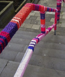
There's a Gremlin in system
I couldn’t help but smile when I saw this Out of Order notice at Cineworld. Great bit of copywriting.
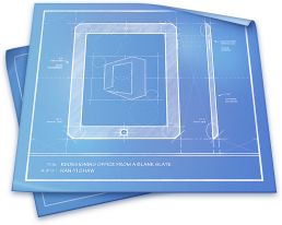
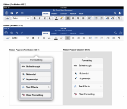
The art of designing Office for iPad
Microsoft’s design manager for Office for iPad has posted an interesting piece discussing the company’s design philosophy behind the software.
Han-Yi Shaw writes about the scenarios that the team envisioned Office for iPad users would find themselves in, as well as the user experience goals they had:
- Familiar Office experience, with no learning curve
- Unmistakably Office, optimized for iPad
- Immersive and removes distractions
- Document content, not UI, takes center stage
- Experience is always beautiful, fast, and fluid
“The purpose of a familiar Office experience is simple: a low learning curve and high user confidence. However, it’s just as important to strike a balance between “unmistakably Office” and “platform optimization,” which means optimizing for iOS platform conventions and touch-first user expectations. The most important, yet challenging, goal was finding the sweet spot between the essence of Office and iOS. Fortunately, since the Office for iPad and Mac team (formally known as the Macintosh Business Unit) is made up of Apple platform specialists, we were able to apply our deep knowledge of Apple platforms to the task.”
The piece talks about how Microsoft redesigned ‘The Ribbon’ — the control strip at the top of all Office programs — to mesh with Apple’s design philosophies following the release of iOS 7. “That meant stripping out extraneous detail,” said Shaw. “If there was a visual treatment or text label that wasn’t absolutely necessary, we stripped it away.”
The full article is an interesting glimpse into the Microsoft design team’s work process.
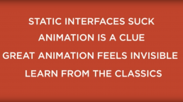
Designing with animation
The goal of animations in UI should be to help users better understand what’s going on and how to use your product most effectively. When used as more than just a subtle design detail, animation can provide cues, guide the eye, and soften the sometimes-hard edges of web interactions. It can improve the user experience.
UI animation is an area I’ve been focused on in my work recently. Whilst researching the subject I came across the above video by Pasquale D’Silva explaining the fundamentals of animation. Not only is it informative, but entertaining too. Well worth a watch!
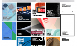
Samsung Design
With all the bad press Samsung have been having recently about copying Apple’s designs, you can understand why their marketing team were keen to show off how innovate they really are via the Samsung Design website.
There are some nice touches to this site, such as the way the navigation menu animates in and the falling domino-like ajax loader, but am I the only one who finds it slightly ironic that the site layout is extremely similar to the Windows 8 Live Tiles?
Questions I ask when reviewing a design
Designs are rarely right first time. It's only by continuously assessing, reiterating and refining design work that the best result emerges over time. This article by Jason Fried of Basecamp lists the questions he asks himself when reviewing his design work. It's helpful to see each one listed down, acting like a quality-assurance checklist.
These are in no particular order, and I not all are applicable all the time:
- What does it say?
- What does it mean?
- Is what it says and what it means the same thing?
- Do we want that? Why do we need to say that here?
- If you stopped reading here, what’s the message?
- What’s the take away after 8 seconds?
- How does this make you feel?
- What’s down below?
- How else can we say this?
- What’s memorable about this?
- What’s that for?
- Who needs to know that?
- Who needs to see that?
- How does that change behaviour?
- What’s the payoff?
- What does someone know now that they didn’t know before?
- How does that work?
- Why is that worth a click?
- Is that worth scrolling?
- What’s the simpler version of this?
- Are we assuming too much?
- Why that order
- Why would this make them choose that?
- What does a more polished version of this look like?
- Why would someone leave at this point?
- What’s missing?
- Why are we saying this twice?
- Is it worth pulling attention away from that?
- Does that make it clearer?
- What’s the obvious next step?
- How would someone know that?
- Would it matter if someone missed that?
- Does that make it easier or harder?
- Would this be better as a sentence or a picture?
- Where’s the verb? Why is that there?
- What matters here?
- What would happen if we got rid of that?
- Why isn’t that clear?
- Why is this better?
- How can we make this more obvious?
- What happens when this expands?
- If we got rid of this, does that still work?
- Is it obvious what happens next?
- What just happened?
- Where’s the idea?
- What problem is that solving?
- How does this change someone’s mind
- What makes this a must have?
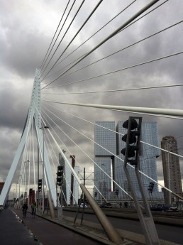
Rotterdam
I visited Rotterdam for the first time last weekend and was blown away by the surreal architecture.
Walking the streets of the Netherlands’ second-largest city feels like wondering through a back catalogue of architects’ bold dreams and daring attempts. There are buildings shaped like spikes and forests of floating cubes. Some look like Tetris blocks, unevenly stacked upon one another.


Design should support activity
A lot of focus in UX design is on user research deliverables. Although these undoubtedly have their place, in my experience, it's very rare to work on a project with the timeframe or budget for such extensive user research.
Of course, it's important to have knowledge about users in general (although not necessarily the specific user base for your website or application) so you know how people generally use web-based products, but I've found it's more important focus on the activity your application is meant to support and design for that.
In his article, 'Human-Centered Design Considered Harmful' UX guru, Donald Norman mentions that many technologies and products have become great not as a result of a deep understanding of users, but rather because of a 'deep understanding of the activities that were to be performed.' He alludes that everything from kitchen utensils to musical instruments are examples of products designed through an understanding of the activities they were meant to support.
User stories
I've found a great way to put the above theory into practice is to write user stories to communicate each project requirement (a user's outcome) and to capture the workflow that will eventually be built into an application to achieve that requirement.
A user story begins with a statement given from the perspective of the user. This is an example of a user story format from Mike Cohn:
As an actor, role, or persona, I want to complete a goal so that I achieve this value.
Example of user stories for a system would be:
As an existing user, I want to be able to sign in so I can view the dashboard.
As a shopper, I want to be able to checkout so I can purchase the items in my shopping cart.
Each user story is then followed up by a list of step-by-step instructions for how an interaction or task may be accomplished. Each step can be kept high level, describing the general situation (for example, User clicks 'Sign In' button), or it can include more detailed descriptions of what actually happens on the screen when each operation is performed.
I find this process valuable as it exposes potential problems and brings to light any assumptions I was making about a task prior to writing it. It also ensures that the developers and I are on the same page.
By taking 20 minutes to write an effective user story, a lot of potential pitfalls can be avoided without investing lots of time on design and prototyping. The rest of the work is figuring out how to implement interfaces that support each user activity and the tasks along the way.

VLC Player's Christmas app icon
Here’s a nice little touch I noticed when opening a film on VLC Player today (Boxing Day).
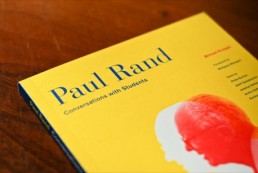
Paul Rand: Conversations with Students
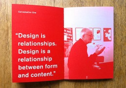
I finished reading Conversations with Students earlier today. The entire book is of an interview/conversation with Paul Rand and reveals lots about him as a designer. It’s inspiring to hear Rand’s strong opinions on design and, despite being incredibly short (only takes an hour to read) it is full of nuggets of wisdom. It’s ridiculously cheap too. If you are a student, or even a professional, go buy this now!
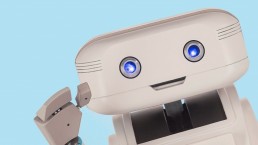
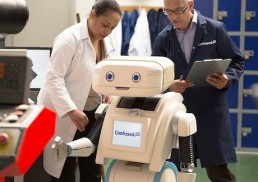
Confused.com's new Identity
Confused.com’s new identity seems a step backwards in my opinion. It’s important for something as mundane as car insurance to have emotional appeal and the old logo, whilst crast, was likeable.
The new robot mascot however, zaps out any possible connection with the brand. Ironically for a brand called confused.com, robots are logical things that don’t really represent confusion.