The Role of a Designer

I’ve just read Designing for Digital Products by Cassie McDaniel, an article about the different roles and work processes of a modern designer.
Something that rings true is how many designers now find themselves in hybrid roles rather than confined to a singular tasks. As technology and work processes have evolved, many existing job titles are overly vague or simply inaccurate.
“Labels like user experience designer, user interface designer, interaction designer, product designer and so on may describe a person’s interests better than another, but most designers do a little of all of this, as “hybrids” (be it designer and coder, user experience and user interface designer, or designer and entrepreneur).”
I see this as a positive thing, it implies that design is seem by many companies as being an integral part of the product design process rather than purely the service of making something look pretty. Designers are ultimately responsible for improving the overall quality of a person’s experience with a company’s content. They help create the most successful – not necessarily the most attractive – solutions to a client’s needs. Making things look pretty is nice, but the real buzz I get out of designing is from exposing problems and creating solutions that make a difference.
All Aboard the Cartoon Express!
This is crazy – the Taiwanese have raised the bar in public-transport advertising by making it possible, as Cartoon Network have done, to advertise throughout the inside and outside of a train. More images at the animation blog Catsuka
It’s the most exciting train since Thomas the Tank…
Tide for Windows Mobile
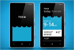
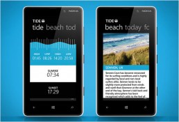
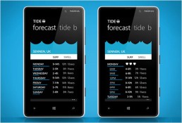
I have just discovered Tide, a beautiful surfing forecast app for the Windows Phone. I haven’t used the app personally as a) I don’t own a Windows phone and b) I have the surfing skills of a brick. However, from watching the app’s video and screenshots, Tide appears to display the information you need brilliantly without going over the top with detailed information and statistics. I’m particularly fond of the constant wave animation that changes according to the sea condition. You can tap and slide up or down to see how the condition changes as time progresses. Judging from the positive reviews on the Windows Phone App Store, the app is pretty useful too – just don’t forget the waterproof phone case!
I hope to see more well thought out apps like this on the Windows phone as I am a big fan of the general look and feel of the Windows Mobile interface but find the lack of decent/useful apps let it down.
The Design of Everyday Things
‘…people feel guilt when they are unable to use simple things, guilt that should be not theirs but rather the designers and manufacturers of the objects’.
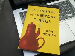
I’m currently 17{b8bd296ca4651438bc43a0e80631385d12589602592b61f9d2d282e84c05cce8} through (according to my Kindle) The Design of Everyday Things by cognitive scientist and usability engineer, Donald Norman. It’s an interesting read about the design of simple objects, and why some objects please their users while others frustrate them. Examples range from doors to telephones and despite being published back in 1988, the principles Norman discusses remain true today and can be related to both product and web design.
I’ve not yet finished the book, but am already viewing everyday objects with a new found appreciation (or condemnation). I recommend this book to anyone involved with or interested in any kind of design work.
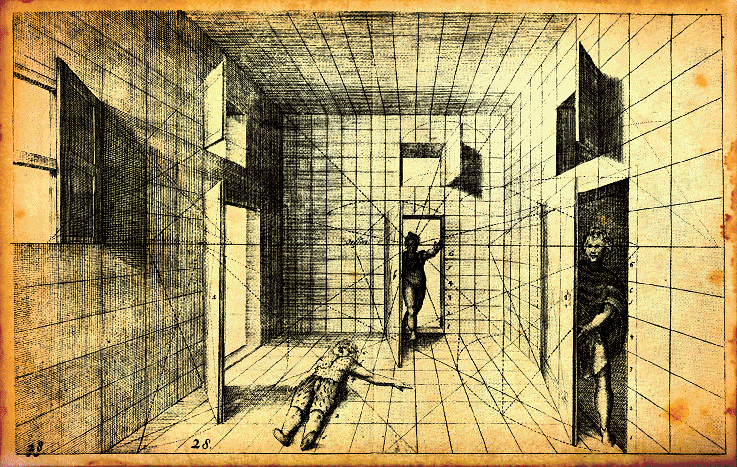
A Short Lesson in Perspective
Written by Linds Redding a few months before he died last year aged 52, “A Short Lesson on Perspective” is a must-read when we need reminders not to take ourselves too seriously.
“Pretty soon, The Overnight Test became the Over Lunch Test. Then before we knew it, we were eating Pot-Noodles at our desks, and taking it in turns to go home and see our kids before they went to bed.”
It would would be unjust to summarise the rest of the essay. Rest assured that it is insightful and melancholy and quite beautiful. It embraces both regret and failure and denies self-pity. I’m glad I spent ten minutes reading it.
A Logo Design Master Class with Will.i.am
Will.i.am gives advice on logo design. This is either incredibly cringeworthy or comedy genius. I’ve not decided yet.
Honda "Hands"
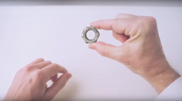
Here’s a really intelligent and entertaining bit of marketing from Honda that celebrates the curiosity of its engineers over the past 65 years. The tone and style are perfect; feels really timeless.
It’s up there with “Cog”, one of my favourite ads of all time. Only minor post-production editing was required – amazing!
Credit: Wieden + Kennedy
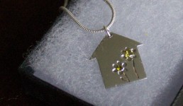
Isleham Preschool Necklace
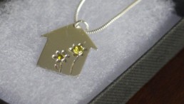
The logo I designed for Isleham Preschool has been recently crafted into a silver necklace by jewellery artist, Dizzydollylou – looks fantastic!
Authentic Design
Here’s an interesting article on the recently popularised ‘flat’ design style which is taking prominence over the, now dated and sometimes ridiculed, skeuomorphic style many of us have become accustomed to.
The author makes an interesting comparison between the style progression happening now and the progression that occurred throughout the first half of the 20th century;
‘In its desire for authenticity, the Modern design movement curbed the ornamental excess of the 19th century, making design fit the age of mass production. Today, we’re seeing the same desire for authenticity manifest itself in the “flat” trend, which rejects skeuomorphism and excessive visuals for simpler, cleaner, content-focused design.’
You can read the full article here.
Skeuomorphic design isn’t bad per se – well implemented skeuomorphic design elements can build familiarity and convey functionality, important ideas and even feelings to users. However, what we’ve been seeing with some apps websites over the last few years is complete overkill. It’s time to give those over-milked skeuomorph udders a break.


