Background
Isleham Preschool is a community-run village preschool. After redesigning their logo, I was asked to have a look at their website, as its unintuitive design and out-of-date content made it obsolete.
It was important to understand who would be using the website and why
User Research
Starting from scratch and assuming nothing, it was important to understand who would be using the website. I began by analysing the website’s purpose; what were the common reasons for visiting? What frustrations did users have on the existing site? To get answers, I conducted interviews with staff and parents at the preschool.
Research revealed that the website was rarely used, if at all, as it was never up to date. Instead, parents relied on termly newsletters and memos from staff to keep them in the loop of any news or announcements. Incidentally, the staff were looking to cut down on the preschool’s paper usage, as well as the time it took to print and distribute newsletters to parents. Another frustration raised by a parent, revealed it was not possible to contact the preschool via the website directly. These were clearly things the new website could provide a solution to.
Most users I interviewed did not consider themselves very tech savvy. Despite this, it transpired that just under half of them owned a smart-phone and a couple owned tablet too – a number that was sure to grow.
It emerged that there were three primary scenarios when visiting the preschool’s website:
- A parent or guardian looking to enrol his/her child visiting the website to find out more about the preschool (OFSTED reports, about the setting etc.), then get in contact to make an enquiry.
- A parent or guardian of a child already attending the preschool, looking for current information (latest newsletter, curriculum plan, term dates, general news etc.).
- A preschool visitor (contractor, inspector etc.) looking for directions and contact information.
Website objectives
Talking to the users defined who they were and the requirements they had. This allowed me to begin planning a website that provided solutions to their needs.
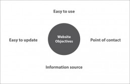
Firstly, it was clear that the website had to be built in a way that allowed staff to update key information themselves. This would eradicate the need for printed newsletters and provide parents with an easy way to access the latest information.
Secondly, the website needed to be easy to use so that parents – even the technological nervous ones – were encouraged to actually use the site. There would be no point in the staff uploading information if half the parents weren’t going online to view it.
Thirdly, it was vital that contacting the preschool, either via the website or otherwise, was easy and obvious.
Planning Pages, Content and Structure
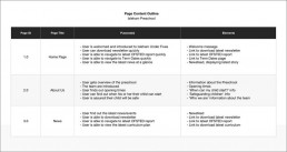
Before establishing the website’s appearance, it was important to determine the pages it would contain and the purpose of each one. This was to ensure that the content and layout of each page was relevant to the user. The purpose and content requirements of each page were outlined with the client.
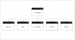
Task Flows were used to envision how users with differing objectives would advance through the website and a Site Map was created to show how each page would link together. I used Jesse James Garrett’s Visual Vocabulary as a guide when illustrating the architecture of the site.
Wireframing
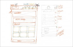
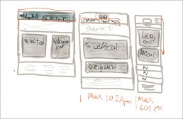
With the purpose and content defined, wireframes were created to clarify the layout of each page. It become apparent early on in the project that it would be beneficial for users for the website to be designed responsively – it would ensure that the site would be legible on a large variety of screen sizes – from smart-phones to large PC monitors. Planning was required to ensure the page layouts would adapt in a way that prioritised key features and information. I explored several layout ideas with rough sketches.
Visual Design
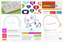
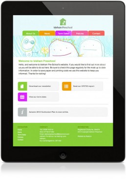
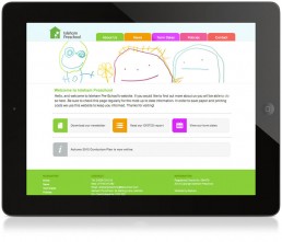
Once I was happy the webpages had an effective layout system, I progressed to the computer and began working on the visual style. Visual research was conducted for inspiration and design ideas developed further in Photoshop. It was decided the website would use bold colours and icons with a clean layout for maximum usability. For personalisation, drawings by young artists attending the preschool were scanned-in to be featured on each page.
Web Development & Testing
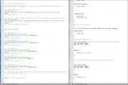
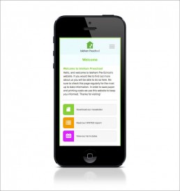
Once the foundational visual design style was in place, web development commenced. Responsinator was used to test how the website would work on a wide range of devices. Web development, visual design and further wireframing happened simultaneously as certain limitations became apparent. A cloud based CMS was added to give staff the power to easily update key website content. Prior to launch, I asked several target users to use the site on a test server to ensure they were able to complete key tasks easily. The feedback was positive – it was time for launch!


