Background
iRev is a Nigerian based technology reseller providing businesses with ‘the best technology at affordable prices’. A brand identity was required to make iRev rise above the competition. It was important the identity was flexible enough to adapt to the various iRev divisions and that the logo was legible in both large and small sizes – it would be applied across a wide range of media, from flash drives to magazine advertisements.
Defining the Brand
Defining a brand’s personality is a crucial first step to creating a strong and meaningful brand identity. The company’s vision and values were reviewed and the competitive landscape was evaluated to gauge how iRev would fit into customers’ lives. Several exercises and techniques helped uncover these:
Keywords
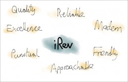
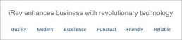
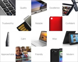
At the beginning of the project the client was asked to fill out a Project Planning Sheet which formed the basis of the design brief. A key question asked for five to ten keywords that best described the brand. The answer given gave a good indication about how the brand should be portrayed.
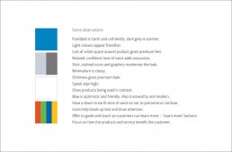
Characteristic Spectrum
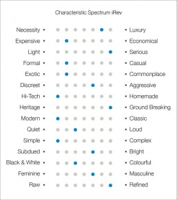
A Characteristic Spectrum was used to define key visual and personality traits that expressed the brand. It gave guidance on how the brand should be characterised.
Refining the Brand Definition
Lessons from the brand definition stage were compiled and refined in the form of a brand vision and key adjectives. The prior work gave guidance on how the brand should be depicted, which influenced the visual design work, further on in the project.
Brand Positioning
Several ‘Brand Walls’ were created to provide a competitive landscape. Seeing what else is out there gave insight to how iRev would sit amongst the competition. It became apparent there was little direct competition at the time as everything was generally brought from local hardware stores. From the examined competing brands, it was observed that there was a lot of emphasise on low-prices rather than quality. Visually, the brands were unrefined and inconsistent – iRev would stand out with its superior quality.

Visual Design
The visual design process involved several stages:
Visual Research
The prior stages provided guidance on the visuals to explore. It was important that iRev came across as a premium and trustworthy company with high standards. iRev’s keywords and brand attributes were explored visually, which led to several observations and indicated potential visual styles to use. Brands with similar qualities to iRev were also analysed, focusing on aspects such as language, tone, colours, textures, imagery etc.
Looking at the Bigger Picture
Several brand mood boards were created to envision what it would feel like to interact with the brand. Rather than start with the logo, I prefer to explore ideas around colour, image-style, tone etc. when gathering ideas for a brand’s visual identity. This gives the logo context and indicates how and where it will be applied.
Logo Idea Generation
With the bigger picture in place, possible logo concepts for iRev were sketched. I aimed for quantity at first – quickly sketching ideas as they came to me. This forced the rapid generation of new ideas with little thought on how foolish something initially seemed. One thing taken into consideration was that the client was very keen for the logo to feature a globe. I wasn’t keen on the idea myself initially, but it was taken into consideration in case there was a way to make it work.
Design Development
Several rounds of idea generation later, each idea was evaluated and the strongest ones developed further on the computer. The logo concepts were refined and additional ideas explored until three possible design directions were ready to present.
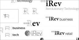
The Selected Design
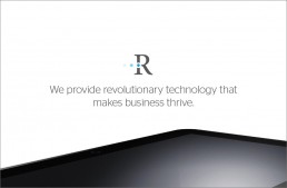
The client was extremely happy with the designs and the final logo was selected. A serif typeface was chosen to portray maturity for customer assurance. Within the ‘R’ a subtle ‘i’ is formed, creating the company’s initials. The trailing dots on the ‘i’ symbolise the flow of information and pulsate and change colour with each different division of iRev.
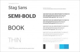
The typeface and colour scheme compliments the logo and communicates iRev’s personality. The typeface conveys an air of trust and confidence whilst the minimal colour scheme that allows the products to shine. It was extremely important for the client that the business cards had a premium appearance. They have a minimal design printed with Spot UV for a subtle shine.