Microsoft’s design manager for Office for iPad has posted an interesting piece discussing the company’s design philosophy behind the software.
Han-Yi Shaw writes about the scenarios that the team envisioned Office for iPad users would find themselves in, as well as the user experience goals they had:
- Familiar Office experience, with no learning curve
- Unmistakably Office, optimized for iPad
- Immersive and removes distractions
- Document content, not UI, takes center stage
- Experience is always beautiful, fast, and fluid
“The purpose of a familiar Office experience is simple: a low learning curve and high user confidence. However, it’s just as important to strike a balance between “unmistakably Office” and “platform optimization,” which means optimizing for iOS platform conventions and touch-first user expectations. The most important, yet challenging, goal was finding the sweet spot between the essence of Office and iOS. Fortunately, since the Office for iPad and Mac team (formally known as the Macintosh Business Unit) is made up of Apple platform specialists, we were able to apply our deep knowledge of Apple platforms to the task.”
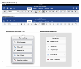
The piece talks about how Microsoft redesigned ‘The Ribbon’ — the control strip at the top of all Office programs — to mesh with Apple’s design philosophies following the release of iOS 7. “That meant stripping out extraneous detail,” said Shaw. “If there was a visual treatment or text label that wasn’t absolutely necessary, we stripped it away.”
The full article is an interesting glimpse into the Microsoft design team’s work process.


